Alternative Ways To Track Savings I Bond Values (Tools and Calculators)

My Money Blog has partnered with CardRatings and Credit-Land for selected credit cards and may receive a commission. All opinions expressed are the author’s alone, and has not been provided nor approved by any of the companies mentioned.

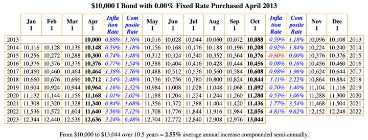
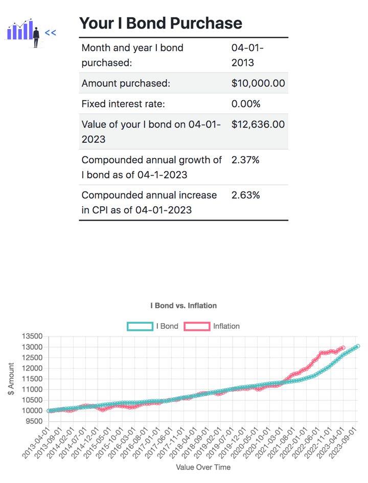
If you have accumulated some savings bonds but don’t really enjoy logging into TreasuryDirect.gov all the time, here are some alternative methods to tracking your balances over time. Each has its own strengths and weaknesses, and the unofficial ones are the results of motivated DIY investors. As an example, I will track a Savings I Bond purchased in April 2013 for $10,000.

Official TreasuryDirect Savings Bond Calculator

Although this official calculator states that it is only meant for paper savings bonds, you can still use it indirectly to track electronic savings bonds (they have the same value as long as they are issued the same month). For example, let’s say you bought $10,000 of I Bonds issued in April 2013. While you can’t enter a $10,000 value directly, you can enter two $5,000 I Bonds. (Enter anything for serial number.) Thus, you’d see that as of April 2023, they are worth $12,636.

You can even save your entire inventory of specific I bonds if you follow the directions here. It feels a bit archaic (you’re basically saving a plain text .html file), but it works. You can even import the values into Google Sheets, according to this Bogleheads forum post.

EyeBonds.info

Created by a user on the Bogleheads forums, this is a very handy and simple website that tracks the price of every savings bonds based on the issue date. For April 2013, simply click on that date and see the growth in value shown below. As of April 2023, you get the same $12,636 value and since the rate is known for the next 6 months as well, you can see the value all the way out to October 2023. This may lead to the easiest way to import the values into your own custom Google Sheet; check out Bogleheads forum post.

eWorkpaper I Bond Calculator

This site also allows you to look up the price history of savings bonds based on the issue date. For April 2013, there are the same ending values along with a chart comparing the value against CPI inflation. You can also quickly create a list of multiple savings bonds here, although it doesn’t appear to allow you to save it for later.

(I personally use these tools once in a while for research, but for tracking balances I simply log into TreasuryDirect.gov during my quarterly portfolio updates and manually enter the values into my Google Sheets page under the “Inflation-Protection Bonds” asset class. It’s only four times a year, and I like to log into the official retro website to make sure my money is still there.)

My Money Blog has partnered with CardRatings and Credit-Land for selected credit cards, and may receive a commission from card issuers. All opinions expressed are the author’s alone, and has not been provided nor approved by any of the companies mentioned. MyMoneyBlog.com is also a member of the Amazon Associate Program, and if you click through to Amazon and make a purchase, I may earn a small commission. Thank you for your support.

Better Future: Free Background Check Powered by Checkr

My Money Blog has partnered with CardRatings and Credit-Land for selected credit cards and may receive a commission. All opinions expressed are the author’s alone, and has not been provided nor approved by any of the companies mentioned.

(Update 2023: Better Future suspended their free background checks during the pandemic, but I just noticed that they are back up and running, An inaccurate background check can prevent you from getting a job, so it is better to check now and start the process to dispute any incorrect information immediately.)

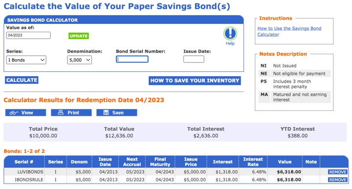
While updating my posts on free Consumer Data Reports, I noticed that Checkr offered a free background check via the BetterFuture.com website. No credit card required, no trials. Checkr is a legitimate company that provides background checks for Uber, Lyft, Postmates, and Instacart, so I valued their results more than most other “free lookup” sites.

The benefit of knowing what is on your background check is that you can fix any inaccuracies before applying for employment. In return, Checkr makes money by trying to connect you with relevant job opportunities based on your unique information.

Better Future takes your basic information (name, address, SSN) and pulls data from federal databases and public records from over 3,200 local counties. The sections of the background check report are:

  • Address History
  • SSN Trace
  • Sex Offender Search
  • Global Watchlist Search (International crime databases)
  • National Criminal Search
  • County Criminal Searches

I decided to run a free background check on myself, and it only took about an hour even though it said it might take up to 3 days. The information shown was all correct to my knowledge. Here’s a redacted screenshot of my report:

The background check does not include Employment History, Driving Records, or Civil Records. Here is the disclaimer that comes with the report:

This background check is for the named individual only. Better Future searched the sources listed below based on the information you provided. Failure to provide accurate or complete information may affect results. Third parties, such as potential employers, may search other databases for information about you. This is not a “consumer report” as defined by the Fair Credit Reporting Act (FCRA) and may not be used for determining any person’s eligibility for credit, insurance, employment, housing, or for any other purposes covered under the FCRA.

Bottom line. Checkr offers a free background check via BetterFuture.com. No credit cards, no trials. In return, they can match you up with job opportunities (optional). I signed up for a free report and I found no errors in the information.

My Money Blog has partnered with CardRatings and Credit-Land for selected credit cards, and may receive a commission from card issuers. All opinions expressed are the author’s alone, and has not been provided nor approved by any of the companies mentioned. MyMoneyBlog.com is also a member of the Amazon Associate Program, and if you click through to Amazon and make a purchase, I may earn a small commission. Thank you for your support.

Treasury Bond vs. Bank CD Rates: Adjusting For State and Local Income Taxes

My Money Blog has partnered with CardRatings and Credit-Land for selected credit cards and may receive a commission. All opinions expressed are the author’s alone, and has not been provided nor approved by any of the companies mentioned.

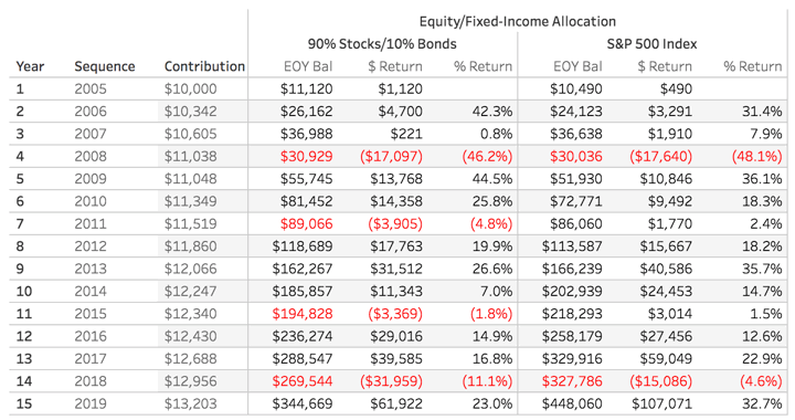
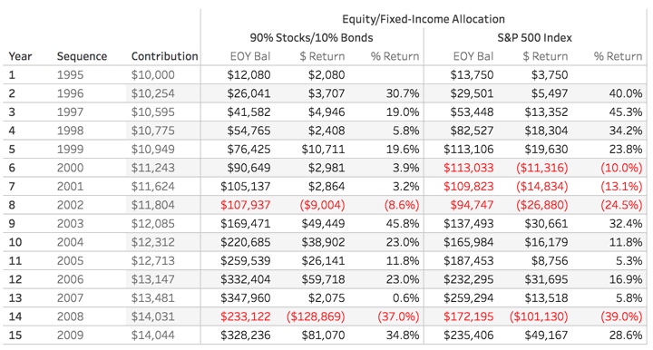
If you are an individual investor that usually buys bank certificates of deposit, right now you may want to compare against a US Treasury bond of similar maturity. Treasury bond rates are traded constantly, but this Vanguard brokered CD page can provide a rough idea if they are worth a closer look (even though their brokered CD may or may not be the best CD rate available). Again, this screenshot is already out of date:

Right now, they are pretty close for many maturity lengths. For example, let’s take a 1-year CD paying 3% APY and a 1-year Treasury bond paying 3%.

(Note: This may not be true by the time you read this. Here are the current Treasury bond rates. In the last two weeks alone, the 1-year Treasury has ranged from 2.79 to 3.21%. In 2022 alone, the low was 0.38%.)

An important consideration is that Treasury bonds are exempt from state and local taxes. This can make the Treasury bond significantly more attractive to some folks, even if the initial rate is the same. This assumes you are investing in a taxable account (not tax-sheltered). US Savings bonds are also exempt from state and local taxes.

For example, let’s say you are a single resident of California with a taxable income of $80,000 annually. Any easy way to compare the rates is by using a calculator like this Fidelity tax-equivalent yield calculator. Using the example income, it will find that your marginal tax rates are 22% Federal and 9.30% State (CA). I am assuming no local tax rates from your city or county.

What matters in the end is what you are left with after taxes. As such, the calculator supplies the following chart:

For this example person, a Treasury bond earning 3% will pay the same after-tax interest as a bank certificate of deposit paying 3.44%.

Here is a rough check on my part:

$10,000 * 3.44% * (1 – 0.22 – 0.093) = $236 in annual interest, after taxes

$10,000 * 3.00% * (1 – 0.22) = $234 in annual interest, after taxes

I suspect the minor difference has to do with the way that bond yields are quoted for Treasury bonds. This is also why the corporate bond yields are different from the CD yields even though they are subject to the same taxes.

Bond yields, except CDs, are assumed to be twice the semi-annual yield, as is the normal convention for quoting bond yields. CD yield is calculated as ((( corporate bond yield / 2) +1)² ) – 1

From the calculator fine print:

The calculator does not take into account:

– Reductions and limits on federal itemized deductions
– State and local taxes are not deducted from your federal tax rate. Depending on your personal situation, this may cause the resulting yield to be overstated.
– Federal alternative minimum tax (AMT)
– State alternative minimum tax
– Intangibles taxes levied by individual states
– Net Investment Income Tax
– Additional Medicare Tax

For practical purposes, I don’t sweat the minor differences. In order to actually buy many of these Treasury bonds at the time that you want and for the remaining maturity length that you want, you’ll have to buy them on the open secondary market. The available rates will change by the minute. Or, if you buy them as a new issue, you won’t know the rate at all as it is determined at auction. I mostly just want to know that the Treasury bond is preferable to a bank CD by an adequate margin. In this example, I would say that 0.44% higher annually is enough of a margin.

There are other wrinkles… if you don’t hold to maturity, Treasury bonds don’t offer the ability to withdraw early and only pay a preset interest penalty like a bank CD. You’d have to sell again on the open market, where you may lose (or gain) principal.

Armed with this information, you might create your own bond ladder using US Treasuries instead of a CD ladder. This is easy for an individual investor because you don’t need any skill to determine creditworthiness. Both US Treasury bonds and FDIC/NCUA-insured certificates of deposit are backed by the full faith and credit of the US government. (Municipal bonds don’t come with such a guarantee. Some municipalities are in better financial shape than others. I don’t buy individual municipal bonds for this reason.)

My Money Blog has partnered with CardRatings and Credit-Land for selected credit cards, and may receive a commission from card issuers. All opinions expressed are the author’s alone, and has not been provided nor approved by any of the companies mentioned. MyMoneyBlog.com is also a member of the Amazon Associate Program, and if you click through to Amazon and make a purchase, I may earn a small commission. Thank you for your support.

Big List of Social Security Tools: Best Time to Start Claiming Social Security Benefits?

My Money Blog has partnered with CardRatings and Credit-Land for selected credit cards and may receive a commission. All opinions expressed are the author’s alone, and has not been provided nor approved by any of the companies mentioned.

Social Security is the largest source of retirement income for a majority of Americans. For about 1/3rd of them, Social Security makes up 90% or more of their retirement income.

ss_percent

Depending on your assumptions, the “lump sum value” of your Social Security benefits is somewhere between $300,000 and $700,000. (Source: Kitces)

Even this large figure ignores the fact that your Social Security income is guaranteed to rise each year with inflation, something no other private annuity company in the world even offers any longer at any price!

Therefore, spending a little time and money in order to consider the many options for Social Security (especially for those married, divorced, widowed, or disabled) can really make a difference. This NYT article (free, gift article) lists a number of services that help you navigate the rules (at a variety of service levels and price points). In no particular order:

I don’t have any in-depth experience with any of these online tools, but when the time comes I’d probably pony up the money (adds up to less than $100 for all three) and compare the results. If they are properly programmed, they should all agree, right?

The tools below go beyond Social Security claiming strategies and more into overall retirement income planning.

Even if you’re still far away from claiming time, be sure to sign up for your official mySocialSecurity account (before a scammer does) and take a peek at your stats each year. For those that like tinkering, try copy and pasting your anonymous data into the SSA.tools website (free) and play around with different future scenarios.

In the end, you may not follow the software recommendations exactly, but simply knowing about the different options and factors can be helpful. In my experience, many people just end up claiming earlier because they want “their” money sooner rather than later without understanding the potential drawbacks. A retiree may want to have their “own” paycheck again if their partner still works.

My Money Blog has partnered with CardRatings and Credit-Land for selected credit cards, and may receive a commission from card issuers. All opinions expressed are the author’s alone, and has not been provided nor approved by any of the companies mentioned. MyMoneyBlog.com is also a member of the Amazon Associate Program, and if you click through to Amazon and make a purchase, I may earn a small commission. Thank you for your support.

Real-World Smoothing Effects of Regular Investments (Dollar Cost Averaging)

My Money Blog has partnered with CardRatings and Credit-Land for selected credit cards and may receive a commission. All opinions expressed are the author’s alone, and has not been provided nor approved by any of the companies mentioned.

Most people must rely on the power of smaller, regular investments from work income to build up their retirement nest egg. In the latest Sound Investing email, Paul Merriman shared a new Lifetime Investment Calculator that helps you see how these gradual investments (dollar-cost averaging) would have added up during various periods, using actual historical returns from 1970 to 2020.

I’ve already tried to illustrate how regular investments of $250 or $500 a month can add up over time. But instead of having to manually gather performance numbers from a Vanguard Target Retirement fund in a spreadsheet, this fancier calculator lets you adjust many more variables. You can choose different asset allocations, stock/bond ratio, investment amounts, and so on. Importantly, the calculator uses actual historical returns, so you can see what would happen if you invested through the 2001 dot-com bust, 2008 financial crisis, and so on.

You can start the sequence of returns from any of the 51 years to replicate your financial picture as if your decisions were available in the past. For example, you could simulate the role of luck by starting or ending your journey in a bull or bear market. It is not a financial planning calculator per se, nor meant to be a complete planning tool, but it allows you to customize both growth (accumulation) and distribution phases based on your personal timeline and investments.

If you aren’t familiar with Paul Merriman, he is an advocate of adding a bit of complexity to index fund portfolios via additional exposure to smaller and value-oriented companies. For a test run, I went for the “Ultimate Buy and Hold Worldwide (70% US/30% International)” portfolio, alongside a simple S&P 500 portfolio.

Here is $10,000 invested every year for 15 years, with small ~3% increases each year with inflation (ideally corresponding with a higher paycheck), starting in 2005:

Here is $10,000 invested every year for 15 years, with small ~3% increases each year with inflation (ideally corresponding with a higher paycheck), starting in 2000:

Here is $10,000 invested every year for 15 years, with small ~3% increases each year with inflation (ideally corresponding with a higher paycheck), starting in 1995:

You can see that an internationally-diversified portfolio may not be the best in some periods, but it also may not be the worst in others. (I admit I am a bit confused as to why the performance numbers for any given year are slightly different for each test run, perhaps someone out there can explain that to me.)

Even in the 1995-2010 period that contained both the 2001 dot-com bust and the 2008 financial crisis, your ending balance would still have ended up much higher than your total contributions with the internationally-diversified portfolio.

My Money Blog has partnered with CardRatings and Credit-Land for selected credit cards, and may receive a commission from card issuers. All opinions expressed are the author’s alone, and has not been provided nor approved by any of the companies mentioned. MyMoneyBlog.com is also a member of the Amazon Associate Program, and if you click through to Amazon and make a purchase, I may earn a small commission. Thank you for your support.

Schwab Plan Review: Free DIY Financial Planning Software

My Money Blog has partnered with CardRatings and Credit-Land for selected credit cards and may receive a commission. All opinions expressed are the author’s alone, and has not been provided nor approved by any of the companies mentioned.

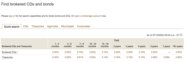
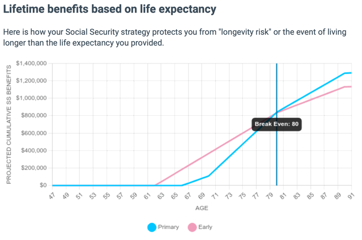
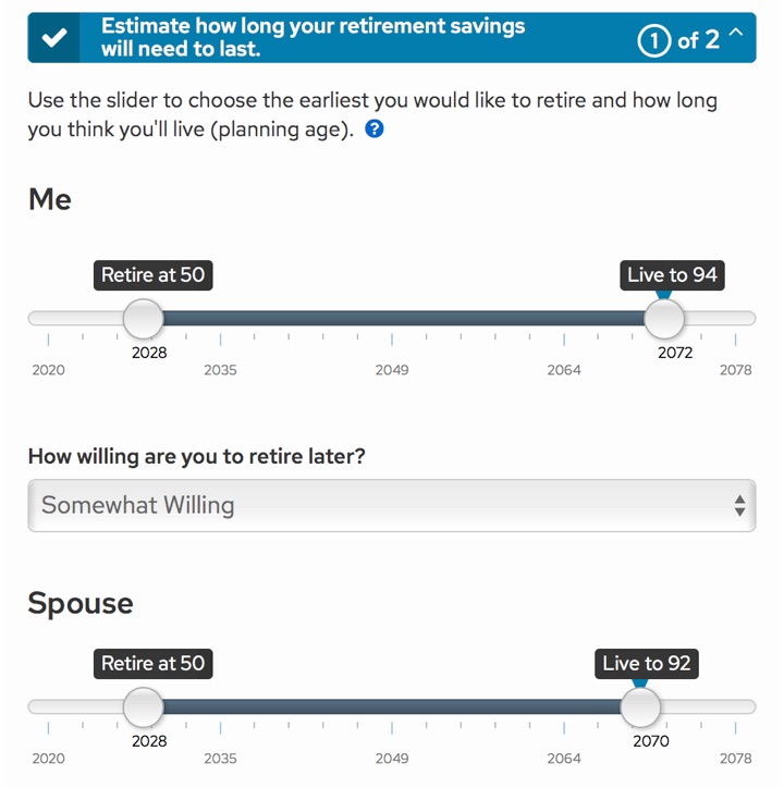
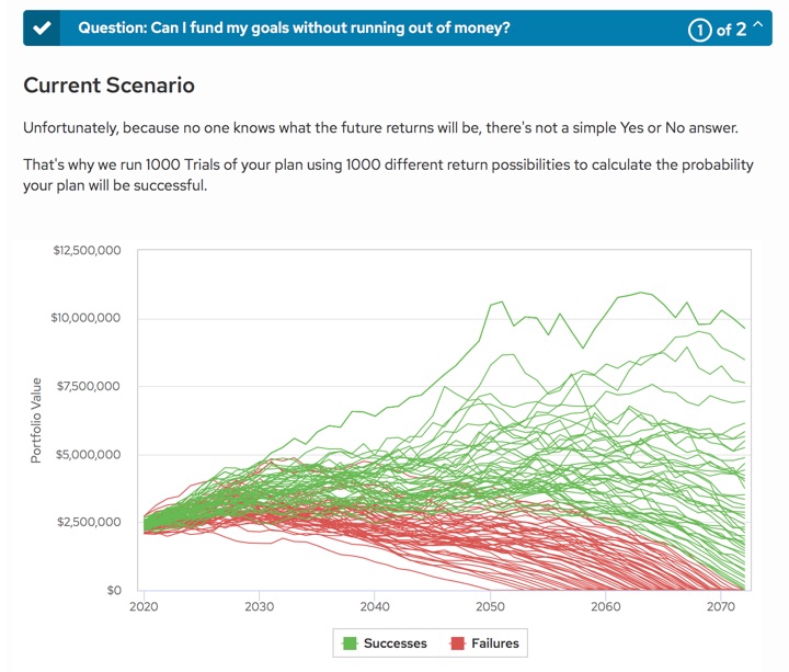
Schwab has rolled out a new digital financial planning tool called Schwab Plan. They claim it to be a simplified version of the same financial planning software used by many human financial advisors. From their press release:

Schwab Plan is a digital self-guided financial plan available through Schwab.com that helps investors build a personalized plan that includes a range of factors such as desired retirement age, retirement goals, social security expectations, portfolio risk profile and asset allocation, and various income sources.

[…] they are able to generate a retirement plan that shows retirement goals and probability of funding those goals, a comparison of an individual’s current asset allocation to a recommended allocation based on plan inputs, and suggested next steps to get and stay on track.

Access to this tool is free to anyone with any type of Schwab account. (Eventually, this should include TD Ameritrade clients as well.) There is no minimum asset requirement and you don’t need to sign up for a new service. For example, I was able to access it with only a Schwab PCRA brokerage window account. Here are a few initial impressions and screenshots after testing it out.

First, you enter some basic personal information like current age, gender, retirement age, and life expectancy:

Next, you estimate your income needs in retirement. They offer additional assistance in estimated your health insurance costs in retirement. You then enter your assets and income sources. Your Schwab accounts are automatically imported, and you can manually add the raw balances of additional external accounts (no account aggregation). They use your information to estimate your Social Security income, and also ask about stock options and restricted stock units.

(They don’t ask about children, college savings, term life insurance, disability insurance, or any of those smaller details that a full-service advisor would ask about. There is also very little customization available in terms of recognizing your external asset allocations.)

Once everything is entered, they run a Monte Carlo simulation to estimate your probability of success.

You can then adjust the variables, such your retirement age and future spending, in order to see how it affects your success rate. I found the analysis to be reasonably consistent with my other research, and I liked that the results changed significantly for an early retirement (45 year period) as opposed to a traditional retirement (30 year period). They use a “confidence zone” system:

(The Monte Carlo simulations above does not equate to an 86% confidence level. This was after making some tweaks to improve the results.)

Bottom line. Schwab has added a free financial planning tool for all of their customers (no minimum asset requirement). After testing it out, it is not quite “professional-grade”, but I did find it to be slightly more advanced than most other free options. I would recommend trying it out if you have any type of Schwab account. Of course, it also provides a pathway to upgrade to their other portfolio management services, and I still have concerns about their Intelligent Portfolios product.

My Money Blog has partnered with CardRatings and Credit-Land for selected credit cards, and may receive a commission from card issuers. All opinions expressed are the author’s alone, and has not been provided nor approved by any of the companies mentioned. MyMoneyBlog.com is also a member of the Amazon Associate Program, and if you click through to Amazon and make a purchase, I may earn a small commission. Thank you for your support.

Money in Excel Review – Good For Budget Tracking, Bad For Investments

My Money Blog has partnered with CardRatings and Credit-Land for selected credit cards and may receive a commission. All opinions expressed are the author’s alone, and has not been provided nor approved by any of the companies mentioned.

Thanks to generous assistance from a reader, I was able to spend some time poking around the new Money in Excel template for Microsoft 365 Personal or Family subscribers. Does it fulfill its promise of helping you “see all your financial accounts in one place, make a plan, and reach your financial goals”? Here’s my rundown of the features that were included and those that were missed.

Accounts Toolbar. After following the clear installation instructions, you can add your various financial accounts using the toolbar on the right-hand side. (I just connected a few secondary accounts for review purposes.) Plaid is used for account aggregation, where you provide your login and passwords and they use that to grab your account balances and transaction history. This data import feeds the rest of the Excel worksheet, but the panel itself is a useful at-a-glance snapshot of your finances. The feel is very similar to the “Overview” page on the Intuit Mint app.

Customized Categories. In the “Categories” worksheet, you can create and edit the names of custom categories used to organize your transactions. For example, I added “Charitable Giving”. You can’t edit the original, default categories.

Transactions. You then move onto the “Transactions” worksheet, where you can edit the categories assigned to each specific imported transaction. If you have a lot of transactions across different bank and credit card accounts, this provides a handy aggregate view of everything together.

Spending analysis. For the most part, this template is about budgeting and spending. Once have all your transactions imported and categories, it will generate some basic charts and provide some simple insights into your expenses. Here are some examples:

  • Spending breakdown by category
  • Current vs. previous month spending
  • Cumulative spending over the month
  • Net worth calculation (assets minus liabilities)
  • Top merchant: Where did you spend the most money?
  • Bank fees: How much are you paying in fees?
  • Subscriptions: Where are your recurring expenses?

This is all useful for someone trying to understand their spending and developing their own budgeting system, but it’s definitely not groundbreaking. Mint.com has providing this type of service for many years. The main differences are that there are no pesky advertisements inside your own Excel worksheet, while the Mint smartphone app may be more convenient.

Missing: Holdings, asset allocation, performance tracking. I am able to connect to an investment account, but it only shows me the total dollar balance. That’s it, as far as I can tell. There is no data on individual holdings, no asset allocation breakdown, no performance tracking.

Missing: Investment transaction list. I am not able to see historical buy/sell transactions on a simple view-only basis, like on the credit card side. It would be nice just to see the last 10 transactions, for example.

There are other portfolio spreadsheets where you can manually input ticker symbols and share counts and they’ll pull in market quotes, but that doesn’t adjust for events like dividends, stock splits, and dividend reinvestment. I was hoping to create a single portfolio spreadsheet using the imported data cells from my brokerage accounts, one that would provide a live view of all my investment accounts, but also allow me to manipulate those data in order to determine if/when to rebalance my portfolio.

For now, I will have to stick with my existing system using both Personal Capital and a custom Google Spreadsheet to track my investment holdings. The Personal Capital financial tracking app (free, my review) automatically logs into my accounts, adds up my balances, tracks my performance, and calculates my asset allocation. Then, I use my manual Google Spreadsheet (free, instructions) to help me calculate how much I need in each asset class to rebalance back towards my target asset allocation.

Bottom line. The “Money in Excel” template for Microsoft 365 Family and Personal subscribers is a free, basic template that imports your spending transactions across different bank and credit card accounts. It can help you with monthly budgeting, but not much beyond that. I hope that in the future they expand it to investment accounts and allow you to have more control over your data. It would also be nice if they made it free for everyone with access to Excel, not just Microsoft 365 Family and Personal subscribers.

My Money Blog has partnered with CardRatings and Credit-Land for selected credit cards, and may receive a commission from card issuers. All opinions expressed are the author’s alone, and has not been provided nor approved by any of the companies mentioned. MyMoneyBlog.com is also a member of the Amazon Associate Program, and if you click through to Amazon and make a purchase, I may earn a small commission. Thank you for your support.

Free Social Security Tool for Optimal Benefit Claiming Strategy

My Money Blog has partnered with CardRatings and Credit-Land for selected credit cards and may receive a commission. All opinions expressed are the author’s alone, and has not been provided nor approved by any of the companies mentioned.

Update: The free Open Social Security tool has been updated to include a new “heat map” visualization that illustrates the relative values of claiming Social Security at different ages. Details here. Here is a sample graph for a couple with similar income histories and the same age:

For this situation, we see that the worst expected outcomes would occur if both individuals claimed really early. The best expected outcomes occur when one claims relatively early and the other claims relatively late.

Original post:

socialsecuritycardWhen to start claiming Social Security to maximize your potential benefit can be a complicated question, especially for couples. There are multiple paid services that will run the numbers for you, including Social Security Solutions (aka SS Analyzer) and Maximize My Social Security, which cost between $20 and $250 depending on included features.

Mike Piper of Oblivious Investor has created a free, open-source calculator called Open Social Security. To use the calculator, you will need to your Primary Insurance Amount (PIA). This amount depends on your future income, so I would first consult this other free Social Security benefit estimator tool to more easily estimate your PIA. I believe the value you see at SSA.gov assumes that you will keep working at your historical average income until your claiming age (which won’t be the case for us).

Here are our results as a couple, assuming we were the same age (we are close) and with my expected benefit being slightly higher than hers:

The strategy that maximizes the total dollars you can be expected to spend over your lifetimes is as follows:

You file for your retirement benefit to begin 12/2047, at age 70 and 0 months.
Your spouse files for his/her retirement benefit to begin 4/2040, at age 62 and 4 months.

The present value of this proposed solution would be $657,749.

Basically, the tool says that my wife should apply as soon as possible, while I should claim as late as possible. I believe this is because this scenario allows us claim at least some income starting from 62, and if I die first after that, my wife would still be able to “upgrade” to my higher benefit.

The tool might take some time to run the calculations, depending on your browser. You can learn more and provide feedback at Bogleheads and Github.

I am not a Social Security expert, and am not qualified to speak to the accuracy of the results. However, Mr. Piper is the author of the highly-rated book Social Security Made Simple, has a history of doing thorough work, and the tool has been around a while now. If I were close to 62, I would probably also use the paid services for a second and third opinion. Why? Spending $100 now could save you many thousands in the future.

The best thing about this free tool is that it can introduce a lot of people to ideas that they would have not otherwise considered. Even if it lacks every bell or whistle, being free means it can help more people. Many spouses wouldn’t think of having one claim as early as possible (age 62), and then have the other claim as late as possible (age 70). It’s not common sense unless you understand the inner workings of Social Security.

My Money Blog has partnered with CardRatings and Credit-Land for selected credit cards, and may receive a commission from card issuers. All opinions expressed are the author’s alone, and has not been provided nor approved by any of the companies mentioned. MyMoneyBlog.com is also a member of the Amazon Associate Program, and if you click through to Amazon and make a purchase, I may earn a small commission. Thank you for your support.

Portfolio Charts Tool Tests Flexible Withdrawals in Retirement

My Money Blog has partnered with CardRatings and Credit-Land for selected credit cards and may receive a commission. All opinions expressed are the author’s alone, and has not been provided nor approved by any of the companies mentioned.

You’ve probably heard of the “4% rule” when withdrawing income from a retirement portfolio. I think using such a rule is fine when you are early in the accumulation phase, although I like the “3% rule” better for early (long) retirements. But heck, reach 25x expenses first and then reassess. However, when it’s actually time to spend down that money, the execution can be tricky. If you start out taking 4% on a $1,000,000 portfolio ($40,000) and then the market drops 50%, will you really take $40,000 (8%) out of your sub-$500,000 portfolio the next year?

Being flexible in your withdrawals works better with both theoretical backtests and natural tendencies. If my portfolio drops 50%, I’m going to tighten the belt and spend less money the next year. Some people may not want to admit this, but I would consider taking on a part-time job again in a severe event. I collect part-time job ideas as part of this Plan B.

On the flip side, if you’ve used a lot of portfolio simulators like FIRECalc and Engaging Data, you’ll notice that your portfolio sometimes gets crazy huge. If your portfolio doubles in size, you might decide to live it up a bit and spend more than 4% of your original amount (inflation-adjusted).

Accordingly, I was impressed to see that Portfolio Charts updated their already-useful Retirement Spending Tool to account for flexible portfolio withdrawals. Everything has been elegantly simplified into four variables:

Withdrawal Rate: the percentage of the portfolio you withdraw every year to fund your retirement expenses

Change Limit: The maximum amount that a withdrawal can increase or decrease from year to year

Account Trigger: A simple rule for when you’re allowed to increase or decrease spending based on how the portfolio is doing relative to its original value

Withdrawal Limit: The minimum or maximum withdrawal you realistically need to pay the bills and live a happy life regardless of what a flexible spending strategy might recommend

Keep in mind that the spending is already inflation-adjusted, i.e. it increases each year with inflation even with no change. Here’s a screenshot:

Take some time to play around with the many combinations. You could see what happens if you let the withdrawals vary wildly. You could see what happens if you only allow the withdrawal amount vary within a tight range. How does your portfolio balance change? For example, I thought about starting with a relatively conservative number like 3% base withdrawal rate, but also be willing to drop it to 2.7% (10% less) if the portfolio drops by 10% in value. Meanwhile, I’d wait until the portfolio increases by 50% before I start paying cash to fly business class everywhere (#goals).

If I were to have a wish list for a new feature, I would like it to show me the minimum balance that the portfolio reached during any of the scenarios. This would let me know the maximum drawdown experienced using my set of variables, as the chart is a little hard to read.

My Money Blog has partnered with CardRatings and Credit-Land for selected credit cards, and may receive a commission from card issuers. All opinions expressed are the author’s alone, and has not been provided nor approved by any of the companies mentioned. MyMoneyBlog.com is also a member of the Amazon Associate Program, and if you click through to Amazon and make a purchase, I may earn a small commission. Thank you for your support.

Free Websites Reveal Your Address History and Names of Relatives (How to Opt Out)

My Money Blog has partnered with CardRatings and Credit-Land for selected credit cards and may receive a commission. All opinions expressed are the author’s alone, and has not been provided nor approved by any of the companies mentioned.

mag

Updated 2019 with more websites. “People would care more about privacy if they knew how exposed they already are online,” says Geoffrey A. Fowler in his WSJ article Your Data Is Way More Exposed Than You Realize.

I hear this all the time: “I have nothing to hide.” The truth is, pretty much everybody does something online they have reason to keep private.

I would have to agree. These days, it just takes a few clicks to find out your age, current and past addresses, phone numbers, and the names of your parents, siblings, children, cousins, and in-laws (and thus all of their information). Try entering your own name and city into one of the first few websites on this list:

  • Peoplefinders.com – Public access to your current and past addresses, phone numbers, relatives and associates. Opt out at www.peoplefinders.com/manage.
  • InstantCheckMate.com – Public access to your current and past addresses, phone numbers, relatives and associates. Opt out at www.instantcheckmate.com/opt-out.
  • FamilyTreeNow.com – Public access to your current and past addresses, phone numbers, relatives and associates. Opt out at www.familytreenow.com/optout.
  • TruePeopleSearch.com – Public access to your current and past addresses, phone numbers, relatives and associates. Opt out at www.truepeoplesearch.com/removal.
  • MyHeritage.com – Must e-mail them at privacy@myheritage.com to remove information.
  • Geni.com – Must e-mail them at privacy@geni.com to opt out.
  • Spokeo.com – Public/paid access to birth month, email, current and past addresses, phone numbers, relatives, social networks and court records. Opt out at spokeo.com/optout.
  • Acxiom is a data broker that uses information to target ads and marketing. I found some unique data on there, although supposedly it’s not public (just up for sale). Opt out at acxiom.com/optout.

Opt out. For most of these websites, there is an opt-out option hidden in either their “Terms & Conditions” or “Privacy Policy” pages. Even though many of these sites appears to be clones of each other, you must opt out of each of them individually. The only “good” news is that where available, my opt out requests were fulfilled and I can’t find those records even a year later. It’s like stomping a cockroach but knowing there are more that you just can’t see.

Here are some related resources:

Facebook and Google serve as bottomless vacuums of your personal data. These tools help show you exactly what they keep.

  • StalkScan.com – Not public. Just links to specific parts of your own Facebook profile. Find out everything that Facebook stores about you, even if it’s hard to find otherwise.
  • Google Maps Timeline – Google may be tracking your location all day long and keeping records forever. Not public. You can log in and request your data to be deleted.
  • Google My Activity – Google may be tracking every search and your web browsing history and keeping records. Not public. You can log in and request your data to be deleted.

Free Consumer Reports. You can also get a copy of your data stored at official consumer reporting agencies via the Fair Credit Reporting Act (FCRA).

My Money Blog has partnered with CardRatings and Credit-Land for selected credit cards, and may receive a commission from card issuers. All opinions expressed are the author’s alone, and has not been provided nor approved by any of the companies mentioned. MyMoneyBlog.com is also a member of the Amazon Associate Program, and if you click through to Amazon and make a purchase, I may earn a small commission. Thank you for your support.

Retirement Nest Egg Calculators: Running Out of Money vs. Running Out of Time

My Money Blog has partnered with CardRatings and Credit-Land for selected credit cards and may receive a commission. All opinions expressed are the author’s alone, and has not been provided nor approved by any of the companies mentioned.

If you have researched retirement at all (early or otherwise), you’ve probably ran across various retirement calculators online. You input how much money you have (or plan to have), your asset allocation, and it spits out some numbers. This Vanguard Retirement Nest Egg Calculator is a good example of a simple version.

Let’s try an example. If I am 40 years old and thus assume I have up to 50 years left in retirement, and I want to maintain a 4% withdrawal rate ($40,000 a year from a $1,000,000 portfolio that is 65% stocks/30% bonds/5% cash), the tool uses Monte Carlo simulations to calculate that I have an 80% chance of lasting 50 years.

There is effectively one output: the odds of not running out of money. Either you still have at least a dollar, or you don’t. In my example, I have an 80% chance of having $1 or more at age 90.

But what if you also considered the odds of running out of time? Yes, that’s a euphemism for dying. (Ever notice how many of those we have?) In another neat tool from Engaging-Data.com, Will Your Money Last If You Retire Early? adds some helpful nuance to this analysis. You input the same types of information, but now in any given year you are provided the overall odds of each of these things happening:

  • Red – You are alive, but ran out of money.
  • Light green – You are alive, with less money than you started with. (Kinda nervous?)
  • Green – You are alive, with between 100% and 200% of what you started with. (Nice and comfy.)
  • Dark green – You are alive, with over 200% of what you started with. (In hindsight, I didn’t need to save so much…)
  • Grey – You are pushing up daisies. (In hindsight, maybe should’ve retired earlier…)

Here are sample results for the early retirement scenario above at 4% withdrawal rate (age 40, retirement horizon 50 years, $40k from a $1m 65/35/5 portfolio). I picked the female mortality table – if you have a male/female couple, it’s safer to pick the person likely to live longer.

There’s an angry streak of red where I’m broke. Of course, there’s a bigger streak of grey where I’m not breathing.

Here’s the same scenario, except with a lower 3% withdrawal rate ($30,000 a year from a $1,000,000 initial portfolio):

That change got rid of the red, but there is a lot of dark green. (1% makes a big difference.)

Here are sample results for a more traditional retirement scenario: (age 65, retirement horizon 25 years, $40k from a $1m 65/35/5 portfolio)

As a financially conservative person, these charts help illustrate why I prefer working with a 3% safe withdrawal rate for early retirement (50 and under) and 4% safe withdrawal rate for traditional retirement (closer to 65).

My favorite part of this tool is that it makes you take into account your mortality. It’s not all about staying above $1 in the bank, but also about maximizing your years of freedom. If you’re 40, you have a 10% chance of dying before even reaching 65. (This is why most people know someone who died shortly after retirement.) Is it better to have zero chance of broke and be 70, or 5% chance of broke and 60 with 10 more years of retirement (and 10 fewer years of work)? It is better to live a little more luxuriously for shorter time, or a little more frugally for a longer time? Playing around with all the different input variables might help you weigh the options.

My Money Blog has partnered with CardRatings and Credit-Land for selected credit cards, and may receive a commission from card issuers. All opinions expressed are the author’s alone, and has not been provided nor approved by any of the companies mentioned. MyMoneyBlog.com is also a member of the Amazon Associate Program, and if you click through to Amazon and make a purchase, I may earn a small commission. Thank you for your support.

How Much Do You Need To Save For College? Vanguard 529 Calculator

My Money Blog has partnered with CardRatings and Credit-Land for selected credit cards and may receive a commission. All opinions expressed are the author’s alone, and has not been provided nor approved by any of the companies mentioned.

Thinking about 529 plans and like playing around with interactive calculators? This Vanguard tool helps you visualize how much you’ll need to save for college and how changing up a specific factor would affect your results. It adjusts for age, contributions, investment returns, tuition inflation, and even looks up the current cost of your favorite university. A formal report is spit out with lots of charts, just like a financial advisor might create for you. Here’s a sample screenshot:

Tuition inflation is something that I think is hard to predict. However, I couldn’t think of anything better than accepting the default assumptions that investment return will only barely outpace tuition inflation.

If you’d rather have a quick, simple scenario, check out this Vanguard article on the power of automatic savings. If you put away $130 a month automatically every month for 18 years, at a 6% return you’d end up with $50,000. Putting away $50 a month reliably would get you to $20,000.

Nearly half of your final amount would be due to investment growth, which thanks to the 529 plan can be tax-free when used towards qualified educational expenses.

I’m still in the camp that retirement should be prioritized over college savings, but I definitely understand the parental instinct to provide the best educational opportunity possible. I’m still pondering the idea of targeting funding college with 1/3rd savings, 1/3rd spending from current income, and 1/3rd grants/scholarships/loans.

Finally, here is another set of handy Vanguard tools, a 529 Plan Interactive Comparison Map and Tax Deduction Calculator.

My Money Blog has partnered with CardRatings and Credit-Land for selected credit cards, and may receive a commission from card issuers. All opinions expressed are the author’s alone, and has not been provided nor approved by any of the companies mentioned. MyMoneyBlog.com is also a member of the Amazon Associate Program, and if you click through to Amazon and make a purchase, I may earn a small commission. Thank you for your support.