 Thanks to generous assistance from a reader, I was able to spend some time poking around the new Money in Excel template for Microsoft 365 Personal or Family subscribers. Does it fulfill its promise of helping you “see all your financial accounts in one place, make a plan, and reach your financial goals”? Here’s my rundown of the features that were included and those that were missed.
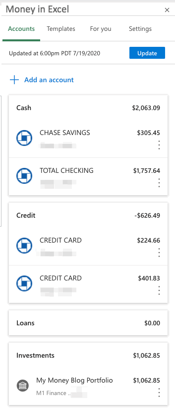
Accounts Toolbar. After following the clear installation instructions, you can add your various financial accounts using the toolbar on the right-hand side. (I just connected a few secondary accounts for review purposes.) Plaid is used for account aggregation, where you provide your login and passwords and they use that to grab your account balances and transaction history. This data import feeds the rest of the Excel worksheet, but the panel itself is a useful at-a-glance snapshot of your finances. The feel is very similar to the “Overview” page on the Intuit Mint app.
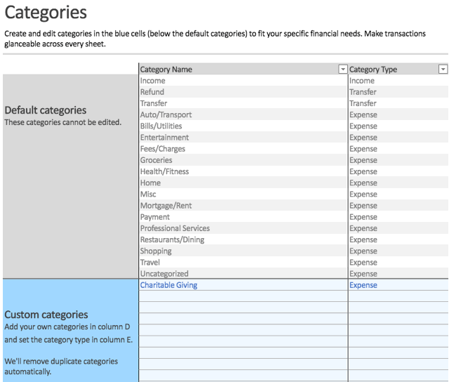
Customized Categories. In the “Categories” worksheet, you can create and edit the names of custom categories used to organize your transactions. For example, I added “Charitable Giving”. You can’t edit the original, default categories.
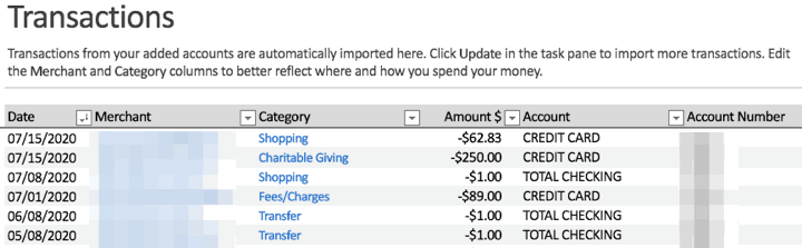
Transactions. You then move onto the “Transactions” worksheet, where you can edit the categories assigned to each specific imported transaction. If you have a lot of transactions across different bank and credit card accounts, this provides a handy aggregate view of everything together.
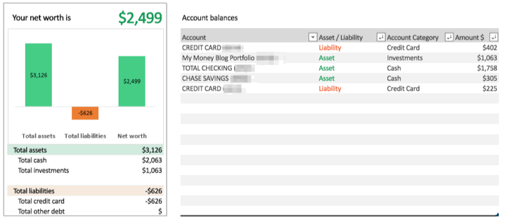
Spending analysis. For the most part, this template is about budgeting and spending. Once have all your transactions imported and categories, it will generate some basic charts and provide some simple insights into your expenses. Here are some examples:
- Spending breakdown by category
- Current vs. previous month spending
- Cumulative spending over the month
- Net worth calculation (assets minus liabilities)
- Top merchant: Where did you spend the most money?
- Bank fees: How much are you paying in fees?
- Subscriptions: Where are your recurring expenses?
This is all useful for someone trying to understand their spending and developing their own budgeting system, but it’s definitely not groundbreaking. Mint.com has providing this type of service for many years. The main differences are that there are no pesky advertisements inside your own Excel worksheet, while the Mint smartphone app may be more convenient.
Missing: Holdings, asset allocation, performance tracking. I am able to connect to an investment account, but it only shows me the total dollar balance. That’s it, as far as I can tell. There is no data on individual holdings, no asset allocation breakdown, no performance tracking.
Missing: Investment transaction list. I am not able to see historical buy/sell transactions on a simple view-only basis, like on the credit card side. It would be nice just to see the last 10 transactions, for example.
There are other portfolio spreadsheets where you can manually input ticker symbols and share counts and they’ll pull in market quotes, but that doesn’t adjust for events like dividends, stock splits, and dividend reinvestment. I was hoping to create a single portfolio spreadsheet using the imported data cells from my brokerage accounts, one that would provide a live view of all my investment accounts, but also allow me to manipulate those data in order to determine if/when to rebalance my portfolio.
For now, I will have to stick with my existing system using both Personal Capital and a custom Google Spreadsheet to track my investment holdings. The Personal Capital financial tracking app (free, my review) automatically logs into my accounts, adds up my balances, tracks my performance, and calculates my asset allocation. Then, I use my manual Google Spreadsheet (free, instructions) to help me calculate how much I need in each asset class to rebalance back towards my target asset allocation.
Bottom line. The “Money in Excel” template for Microsoft 365 Family and Personal subscribers is a free, basic template that imports your spending transactions across different bank and credit card accounts. It can help you with monthly budgeting, but not much beyond that. I hope that in the future they expand it to investment accounts and allow you to have more control over your data. It would also be nice if they made it free for everyone with access to Excel, not just Microsoft 365 Family and Personal subscribers.
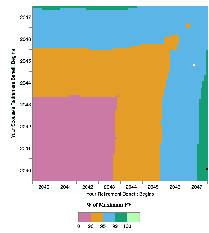
 When to start claiming Social Security to maximize your potential benefit can be a complicated question, especially for couples. There are multiple paid services that will run the numbers for you, including
  You’ve probably heard of the “4% rule” when withdrawing income from a retirement portfolio. I think using such a rule is fine when you are early in the accumulation phase, although I like the “3% rule” better for early (long) retirements. But heck, reach 25x expenses first and then reassess. However, when it’s actually time to spend down that money, the execution can be tricky. If you start out taking 4% on a $1,000,000 portfolio ($40,000) and then the market drops 50%, will you really take $40,000 (8%) out of your sub-$500,000 portfolio the next year?
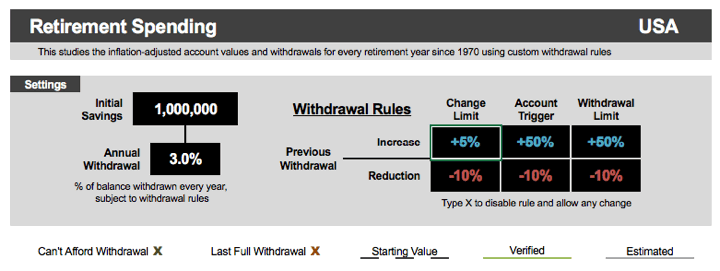


 If you have researched retirement at all (early or otherwise), you’ve probably ran across various retirement calculators online. You input how much money you have (or plan to have), your asset allocation, and it spits out some numbers. This


 Thinking about 529 plans and like playing around with interactive calculators? This


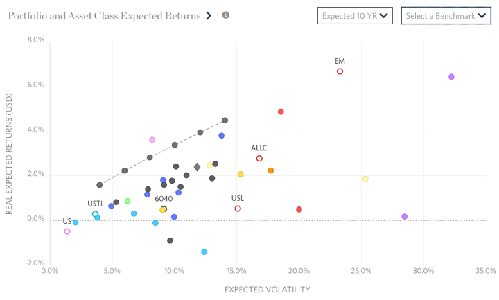
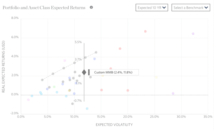
 Here’s another neat (and free!) portfolio analysis tool –
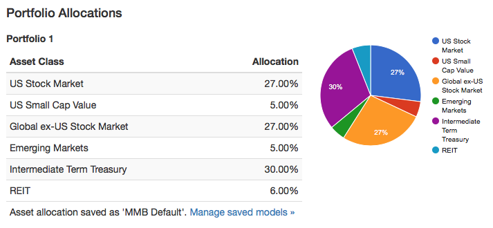
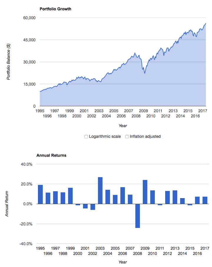
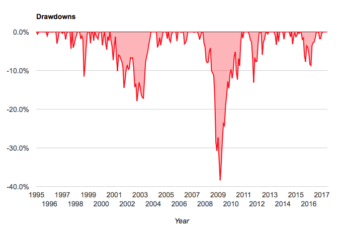


 I just noticed that PortfolioCharts.com has updated their
 The Best Credit Card Bonus Offers – 2026
 Big List of Free Stocks from Brokerage Apps
 Best Interest Rates on Cash - 2026
 Free Credit Scores x 3 + Free Credit Monitoring
 Best No Fee 0% APR Balance Transfer Offers
 Little-Known Cellular Data Plans That Can Save Big Money
 How To Haggle Your Cable or Direct TV Bill
 Big List of Free Consumer Data Reports (Credit, Rent, Work)