The idea that as people earn more, they tend to spend more as well has been termed lifestyle inflation. Derek Thompson in this Atlantic article illustrates this concept using data from the Bureau of Labor Statistics. A family led by a high-school graduate has average annual spending of $35,000. A family led by a Bachelor’s degree holder earns and spends nearly double that at $63,000. Yet both groups spend about 50% of their income on housing and transportation, much like the average household:
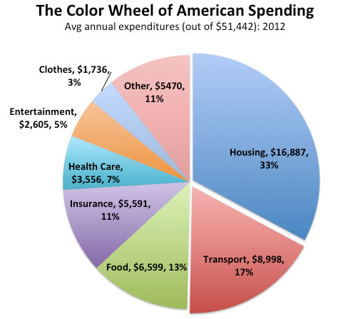
Families with radically different incomes—from lawyers and doctors down to high-school dropouts—all spend about half of it on homes and getting around, which suggests an historically tight relationship between marginal income growth and marginal spending growth on real estate and transportation. You get a raise, you shack up with roommates. You get another raise, you get nicer studio. A bigger raise and you move out to the suburbs and buy a house—commensurably increasing your spending on transportation (bigger car + gas).
We earn more, and we use that extra money to buy bigger houses, nicer cars, and more gas. This blog talks a lot about financial independence, and for most people early retirement is all about your savings rate. Most people spend over 95% of what they earn (source). Early retirement involves spending closer to 60%.
However, we tend to hang out people of similar income and thus we are pulled into “keeping up with the Joneses”. Even if you earn a comfortable income that is well above average, lifestyle inflation can kill any dreams of early retirement. Focusing on managing the big targets, housing and transportation costs, can help.
See also: Your Entire Financial Life in One Deceptively Simple Chart
 The Best Credit Card Bonus Offers – 2026
 Big List of Free Stocks from Brokerage Apps
 Best Interest Rates on Cash - 2026
 Free Credit Scores x 3 + Free Credit Monitoring
 Best No Fee 0% APR Balance Transfer Offers
 Little-Known Cellular Data Plans That Can Save Big Money
 How To Haggle Your Cable or Direct TV Bill
 Big List of Free Consumer Data Reports (Credit, Rent, Work)
Those are great points! If only they could learn to live below their means, right?
We moved into a neighborhood where we make above the average income so we can fit in with the neighbors, but still save quite a bit. We chose the Joneses that we wanted to keep up with. Has been a great decision.
5500 on insurance seems really high, that must include health insurance and ‘health care’ must be deductible? i only spend 1300 on insurance over the year, ex-health. so yes, this makes me feel underinsured…
This chart is so cool–thanks for sharing it. I guess I’m doing pretty well on containing expenses, but I live in a relatively affordable part of the country. It’s easy to scale up without realizing how new purchases can create a domino effect. That big new house will cost more to heat and cool, maintain, and clean, to say nothing of property taxes and insurance. The sporty convertible may need more expensive maintenance than the old econobox. I think one key to avoiding spending creep when you earn more is to think in terms of what upgrades and new purchases will cost you over the long haul.
I assume “Charitable Giving” is in “Other”. I wonder what the % actual percentage is, though. It would make for a nice follow-up article, perhaps?… What would America look like if a much greater number of households/people gave 2x, 3x, 4x, or more to charity than they normally do?
I believe these figures are just out of the BLS CES.
The figure for $5591 for ‘insurance’ would apparently actually be the figure for personal insurance and pensions. Average household spending on personal insurance and pensions is $5591. That includes social security. I’m pretty sure this is the category since the numbers match. So its pretty badly mislabeled if you ask me as most of that spending is really social security. While technically SS is called insurance we really don’t look at it that way.
Interesting. Showed my wife this chart and she freaked out a bit. Then we had to talk about how we live in an expensive area and consume pretty much just veggies, fruits and fish (almost no breads or grains/starches) thus our food bill will obviously be much higher.
Also, kinda proud we only spend about 20% of our income on housing and cars/transportation. I couldn’t sleep at night if we spent 50% of our income on those two things.
When I got my first home 10 years ago at the brink of the bubble people kept telling me it’s my starter home and I will move into something larger. However it’s plenty large at 1000 square feet for at least 4 people and for just myself is enormous.
I have a friend with a larger house but heavy in debt trying to move into an even larger house just because her income increased. I can’t understand this type of compulsion.
I also can’t understand why people spend at least $5000 a year on car expenses and then suffer miserably in traffic. At least you can relax if your bus gets stuck in traffic. Heck, on $5000 a year many can buy daily taxi service or even more car share service and come ahead in money and happiness!
There is some truth to lifestyle inflation for some people, but this is the same government agency that lies about many other statistics like the real inflation rate. That is really kicking everyone financially. And in some cities, you may have to pay a bit more so you are not in the ghetto.
Also, funny that none of these charts ever show the creeping local and state tax burdens thanks to inflation and other factors.
It’s funny how taking taxes out of a paycheck first has been so effective at making people forget that this is where some of their money is going. Being self employed, I get a different perspective. For me, taxes would be on my wheel and would be by far the biggest expenditure. I pay more in taxes than I spend on housing and transportation combined. Also, I see nothing for charitable giving. It must be in the other and constitute less than 3%. It makes up about 10% of my post tax spending.
Agreed, the lack of taxes on this wheel is really brain-warping. The same thing for Health Care where the 4k number is clearly too low for a household and probably fails to include employment benefits that don’t count as “income” part are clearly part of what your employers pays you.
Building that chart at various income levels would definitely change this picture.