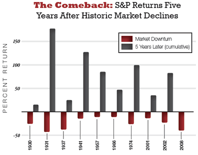
Here’s another chart to ponder, found as part of an Emergency Physicians Monthly article about investing during recessions. It shows what has happened in the past to the S&P 500 five years after a significant market decline.
Or course, you should also remember that if you experienced a 50% drop, mathematically you’ll need a 100% increase to get back to your original point. But your money invested after and during the drop will have done much better.
From the conclusion of the article:
While it’s tempting to shift your portfolio during economic crises, the noise in the data, the lag time between the beginning of a recession and its announcement, the potential false signals, and the historical market returns during recessions suggest that it’s difficult to time the market successfully. With some historical knowledge, we can sail through future stormy markets a bit easier.
Via EmergDoc at Bogleheads.
 The Best Credit Card Bonus Offers – 2026
 Big List of Free Stocks from Brokerage Apps
 Best Interest Rates on Cash - 2026
 Free Credit Scores x 3 + Free Credit Monitoring
 Best No Fee 0% APR Balance Transfer Offers
 Little-Known Cellular Data Plans That Can Save Big Money
 How To Haggle Your Cable or Direct TV Bill
 Big List of Free Consumer Data Reports (Credit, Rent, Work)
Your first word after the graph should be of instead of or. Just thought you should know about your typo.
That’s an awesome chart. I like finding bullish artifacts amidst all the bear fear going on in the markets.
Best Regards,
Dividend Growth Investor
Emergency Physicians Monthly? Really? I guess we have to look pretty hard for stock market bulls right now.
Although the chart is (I assume) factually correct, it implies that the five years after a really bad year have been particularly good. I calculate that the average return over the five years following the ten worst years since 1925 (which are not exactly the same years as in the chart, BTW) was +11.08%. That’s great, but the average annual return for all five year periods since 1925 was +11.39%. So the fact that a really bad year just happened doesn’t really tell you much about what will happen in the near future.
The problem with this chart is that it defines the market downturn as a market bottom and judges the returns from that known bottom. Of course if you go back in hindsight and pick out a bottom, you will have significantly higher returns from that point on. However, we don’t know exactly when the current market will bottom out, and it is therefore foolish to assume that if you invest now you will achieve similar returns.
You nail it on the head. It is harder to recover after a loss, as you mentioned. But I look at this as an awesome opportunity to buy.
I wonder how many “investment experts” eat their own cookin’.
while looking at the charts are ok, one thing that everyone must remember that this is a recession, the kind of which has not happened since the 30s maybe the 80s, its a consumer driven recession which are notoriously tough to break through or put a floor on. Also buy and hold might become kind of a dinosaur after this primarily because the basic fundamentals of the market as was in the last decade are being re-written.
Also take a look at this chart for some serious fun : http://www.chartoftheday.com/20090227.htm?A
Quoting my fav trader/econ analyst on this chart:
“effectively the chart shows that inflation adjusted the market is up 10% since the 1966 peak (42 years). No, that is not 10% a year – that’s 10% total aka 0.24% a year. Buy and hold anyone? (note – it is easy to pick the peak in 66 and make the numbers look quite bad but even if you picked a trough the news is not much better) Since the 1929 peak? (80 years) 55% total return inflation adjusted or 0.7% a year. Again that was a peak reading and if you were so lucky as to have any cash left after the 90% drop during the Great Depression you obviously would hv done better.”
Index funds maynot be the way of the future any more, and that SUCKS for my 401k. The indexing strat is now even more flawed if you take into account the massive dividend cuts that are coming in.
It’s foolish to break it up into calendar years like that (I know you didn’t make the chart, but you posted it). What the heck is one supposed to make of the back to back 1930 and 1931 declines? Hello, those were one decline with a punctuated sucker/bear rally in the middle. Same issue with 2001 and 2002. I’d say even the 1937 decline was part of the same “market” as the 1930 decline. And didn’t the crash happen in 1929? Is that counted? This chart is just full of too many questions to be of any real value.
You also point out the distortion between + and – percentages. I’m glad you pointed that out because the chart’s use of bars should indicate a quantity, not a percentage. Each “bar” here is relative to some unknown quantity defined at the start of some period of time. You categorically can not compare one bar to any other on this chart.
The chart is fundamentally flawed, and I reject it. You should too.
spectralradius: the chart you presented is price only, and does not include dividends.
In any event, i sure hope history repeats itself.
The market will reach its trough, consumer confidence will pick up, and the market will come back around. It’s called the business cycle, but the question is when?
Wow, this chart is terribly misleading.
It presents unequal items with equal sizes.
It provides negatives in one-year intervals and positives in five-year intervals.
This belongs in the humour section. Maybe Jon Stewart can do something with this.