The slowdown continues in my neck of the woods – a recent house that had been stubbornly overpriced for over a year on my street (we actually made a verbal offer, but the seller wouldn’t budge) finally sold for over $120,000 less than its initial list price. I’m sure the relatively low purchase price of our house didn’t help. At least we are not hit by the collateral damage from foreclosures to condo owners who have never missed a payment. When a multiple units are being foreclosed upon, nobody pays the maintenance fees, which means the existing residents have to pick up the slack. Of course, this means less people want to buy into that building… creating a bad downward spiral.
However, some areas seems to be fairing better than others, even if only being one county over. In a recent speech by Ben Bernanke, he showed some interesting geographical heat maps revealing the variation in both foreclosure rates and price trends across the country. Keep in mind the graphs only go until the end of 2007.
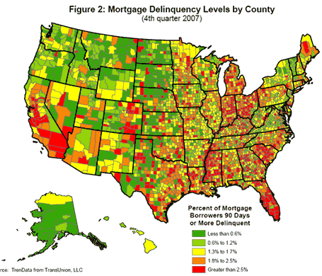
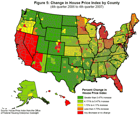
You can find both the text of the speech and additional graphs at the bottom of this Federal Reserve page. Via Matrix via Mapgirl.
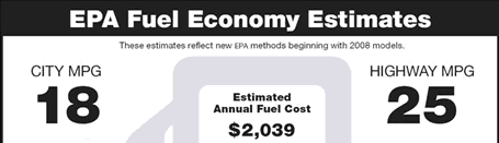

 Everybody’s talking about gas prices… they’ve reached another high, everybody wants a hybrid… so why not explore how an individual can try to limit their exposure to gas prices?


 529 plans have become a very popular tool for saving for college for those that choose to help out their kids (or simply
 The Best Credit Card Bonus Offers – 2026
 Big List of Free Stocks from Brokerage Apps
 Best Interest Rates on Cash - 2026
 Free Credit Scores x 3 + Free Credit Monitoring
 Best No Fee 0% APR Balance Transfer Offers
 Little-Known Cellular Data Plans That Can Save Big Money
 How To Haggle Your Cable or Direct TV Bill
 Big List of Free Consumer Data Reports (Credit, Rent, Work)