The blog Short Side of Long has a nice post discussing the relative performance of several different asset classes over the last few years. The charts especially caught my eye, and I went over to Stockcharts.com to make my own with the asset classes that I prefer to follow.
Here are 2013 year-to-date price charts for selected major asset classes (using representative ETFs): total US stock market (ticker VTI), total international stock market (ticker VXUS), total US bond market (ticker BND), inflation-protected US bonds (ticker TIP), and gold (ticker GLD). Dividends are not included. As mentioned earlier, 2013 was year where assets didn’t move in sync (lower correlations).
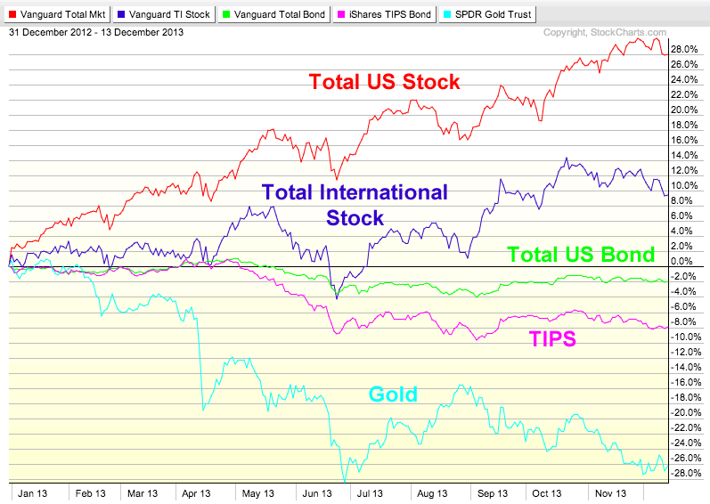
(click to enlarge)
The chart below shows the same ETFs over all of 2012. Looking back, it felt like every asset class ended positively and everything was recovering in 2012.
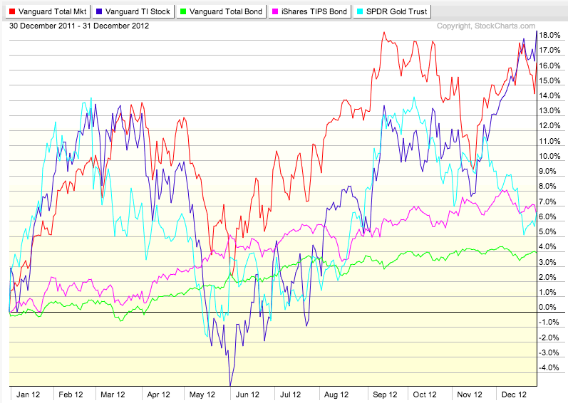
(click to enlarge)
The chart below shows the same ETFs for the past 3 years (January 2011-December 2013, as I can go without paying for a site subscription). Whatever your feelings on gold, I’d still say the price movement is pretty volatile for something that is considered “real money”. Stocks also offered quite a bumpy ride, while bonds again offered a much calmer one.

(click to enlarge)
I do think now is a good time to rebalance your asset allocation if you haven’t done so in a while.
 The Best Credit Card Bonus Offers – 2025
 Big List of Free Stocks from Brokerage Apps
 Best Interest Rates on Cash - 2025
 Free Credit Scores x 3 + Free Credit Monitoring
 Best No Fee 0% APR Balance Transfer Offers
 Little-Known Cellular Data Plans That Can Save Big Money
 How To Haggle Your Cable or Direct TV Bill
 Big List of Free Consumer Data Reports (Credit, Rent, Work)
Thanks for the great charts Jonathan! I just re-balanced my 401(k) 2 weeks ago due to the big run in the US equities. I actually bumped up my investments in emerging markets, thinking if the US market pulls back some, emerging markets may be more of a target for ROI chasers.
I can’t tell if these are total return graphs or just typical price change graphs.
They are price charts, as indicated. I wish I could find a similar charting service that did total return.
Don’t mean anything. If you adjust the starting position to a different date, the chart will look completely different.
The charts look nice, but I must agree with Bobby. However, if you start the beginning at the beginning of the year, it will at least show you the year to year performance, which may be helpful.
@bobby, you are right that changing the start position totally changes the chart. But I disagree that this doesn’t mean anything. Markets general movements can tell us a lot about sentiment and performance of a variety of sectors, industries, etc. There are factors to consider that can skew one or more particular indices or indexes, but that doesn’t mean comparing two is worthless. I often look for divergences in asset classes when making my short to mid term investments.