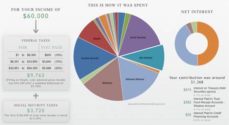
Tax Day has come and gone (unless you filed an extension). Recently, there was a competition to see who could best “create data visualizations that would make it easier for U.S. citizens to understand how the government spends our tax money”. I’m guessing that most people really don’t know, including myself. The winner was WhereDidMyTaxDollarsGo.com, where you simply type in your income and filing status and off it goes.
I certainly found it very visually appealing. It appears to assume you take the standard deduction. I figured that national defense, Social Security, Medicare, and debt interest payments were going to be a big chunk, but wasn’t really aware of how big the “Income Security” category was. Overall, it reminded me of a less-intimidating version of the US Budget poster.
 The Best Credit Card Bonus Offers – 2025
 Big List of Free Stocks from Brokerage Apps
 Best Interest Rates on Cash - 2025
 Free Credit Scores x 3 + Free Credit Monitoring
 Best No Fee 0% APR Balance Transfer Offers
 Little-Known Cellular Data Plans That Can Save Big Money
 How To Haggle Your Cable or Direct TV Bill
 Big List of Free Consumer Data Reports (Credit, Rent, Work)
I was actually kind of surprised by national defense being the biggest chunk… I guess that’s what it takes to have a bigger military than the rest of the world combined!
I noticed the military retirement fund is in both the Military category and the Income Security category… The numbers aren’t the same, though, so I think it’s some kind of accounting issue, rather than a mistake or double-counting. Kind of odd, though.
Kind of interesting.
That said, the tax code is way too complex to even attempt to simplify in this manner. For example, I should pay 20% of my income to taxes (standard deduction), according to this graphic, but I only paid about 10%. Yes, MOST of that was social security.
Deductions were almost $25k with itemizing and IRA contributions. Plus I have 2 kids and a child tax credit, etc., etc. & I actually have a pretty simplistic/common tax situation. No capital gains or anything like that to throw in there.
That is a pretty sweet infographic. Love the customization! Thanks for sharing.
It’s cool, but is it accurate? I tried it with my approximate real income – $52,000 and with my imaginary income –
$520,000 and it came up with the same percentage – 16% for Social Security. Now, that can’t be right, can it?
Im not living in the us anymore but its still interesting how my money has been spent all the years. Thanks for the chart and the link, i will spread it to my beloved friends in the usa.
@ Alexandria: Yeah, this is cute but the code is too complex and customizable for this type of tool. I do like that it separates income tax and FICA tax. Many people do not understand that SS is funded by a separate payroll tax (which is why it is actually solvent for another 25 or so years, unlike other programs and expenditures).
@ Donald: You are right, that is most definitely NOT correct. SS contributions are capped – you only pay on the first $106k.