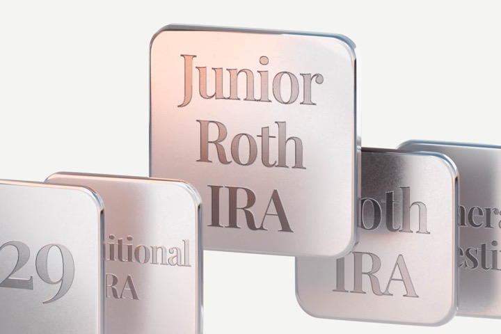
A new automated investing app called FutureMoney is advertising something called the Junior Roth IRATM with some pretty awesome “key benefits”, according to their site:
– Tax-free growth potential
– No earned income required to make contributions
– Favorable FAFSA impact when funded by grandparents
– Optimized for long-term generational wealth building
– Within certain limits, can be used for education, a first home, or retirement.
Since it doesn’t required earned income, it’s not an official Roth IRA for kids (aka Custodial Roth IRA). Somehow, is this even better?!
A Custodial Roth IRA has maximum annual contribution room of $7,000 per year. By comparison, you can invest up to $35,000 for your child is a minor with a Junior Roth IRA over its lifetime, with no annual limit.
After a bit of poking around on their site, I realized that under the hood it’s just a 529 plan with the expectation that when the option is available, they will roll over the 529 plans assets into a Roth IRA account. I didn’t know you could advertise the combined benefits for two completely different things (529 and Roth IRA), make up a name for this thing that doesn’t actually exist, and then trademark it?
There is so much obfuscation on this site!
What is a Junior Roth IRA?
The Junior Roth IRA™, exclusively offered by FutureMoney, allows you to invest up to $35,000 while your child is under 18 and grow that money tax free into their retirement, based on a 529 plan to Roth IRA rollover.
It’s a 529 plan. Full stop.
Therefore, to see the limitations of this method, simply look up any article about the new option for rolling over unused 529 funds into the beneficiary’s Roth IRA without a tax penalty. Here are important limitations to consider, per the Secure 2.0 Act of 2022.
- The originating 529 account must have been maintained for the Designated Beneficiary for at least 15 years.
- The transferred amount must come from contributions made to the 529 account at least five years prior to the 529-to-Roth IRA transfer date.
- The target Roth IRA must be established in the name of the Designated Beneficiary of the 529 account.
- The amount transferred to the target Roth IRA is limited to the annual Roth IRA contribution limit. It is not in excess of the normal contribution limit. This means your child does eventually need to have earned income equal to the amount to be rolled over into the Roth IRA.
- The aggregate amount (total over multiple years) transferred from a 529 account to a Roth IRA may not exceed $35,000 per individual.
I would add that nobody knows what will happen in the “Secure 5.0 act of 2035”. The Roth IRA window might be narrowed, closed, or even opened further. I do think closing it will hard after it’s already been opened, but 15 years can be a long time.
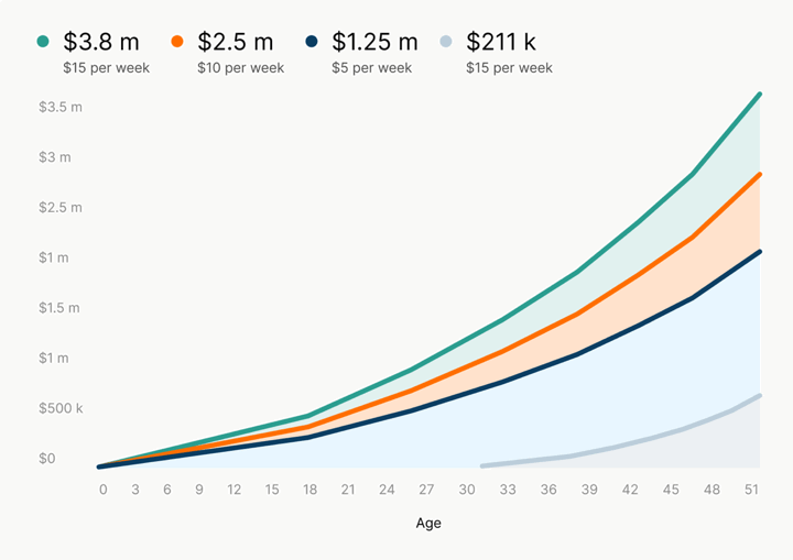
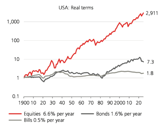
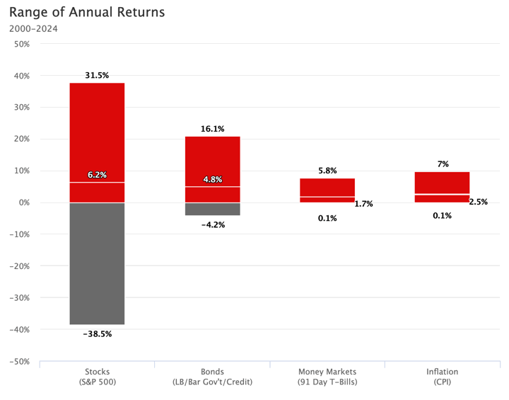
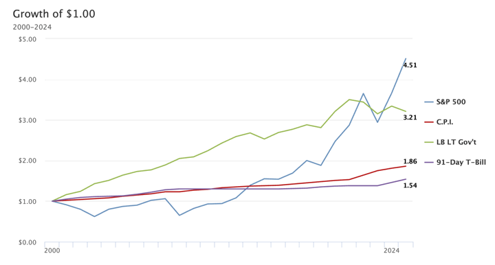
As usual with 529 plans, you can make some pretty impressive claims by combining the power of compounding and a long period of time.
“If a parent invests just $10 a week from their child’s birth to age 18 and then leaves it to grow for 50 years, their child could have a $1 million nest egg, assuming 8% compounding annual returns,” states Dave Fortin, CFA, co-founder of FutureMoney.
Even if it is a 529 plan with a lot of limitations, let’s consider if viewing it as a Roth IRA is actually a good idea. Let’s be honest, this is for relatively rich families that are able to help their kids/grandkids even beyond the enormous, scary cost of a college and post-graduate education. $10 a week ain’t going to do much when college is coming up fast! As they say, the richer you are, the longer your financial time horizon becomes.
For such financially well-off families, I could see this as useful for the years when your child is 16-25. Even though I am a financial nerd now, I didn’t really become financially “aware” until I was 21 years old and didn’t make my first Roth IRA contribution until I was 21 years old. However, I started having “earned income” at age 16 or so. So it may be useful to contribute the money into a Roth IRA at those younger ages (maybe a “parent match”?) when there is a window where they may be earning some money from work, but not enough to be able to defer that money into a Roth IRA on their own.
But again, you can do this with any 529 plan, and the good 529 plans out there already have some low-cost, diversified portfolio options. The Utah plan I picked lets you make a customized glide path using Vanguard and DFA funds. You don’t need this “Junior Roth IRA”.


 The Best Credit Card Bonus Offers – 2026
 Big List of Free Stocks from Brokerage Apps
 Best Interest Rates on Cash - 2026
 Free Credit Scores x 3 + Free Credit Monitoring
 Best No Fee 0% APR Balance Transfer Offers
 Little-Known Cellular Data Plans That Can Save Big Money
 How To Haggle Your Cable or Direct TV Bill
 Big List of Free Consumer Data Reports (Credit, Rent, Work)