It’s not just how much you save, it’s when you save that matters. The best time to start is now. This is the power of compounding returns, which this single chart will help you visualize:
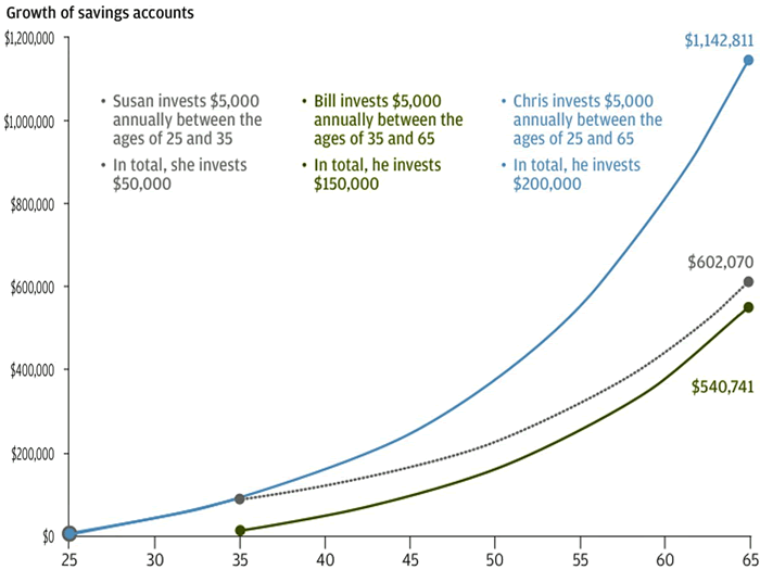
- Susan (grey) invests $5,000 per year from age 25 to 35 ($50,000 over 10 years) and stops.
- Bill (green) invests $5,000 per year from ages 35 to 65 ($150,000 over 30 years).
- Chris (blue) invests $5,000 per year from ages 25 to 65 ($200,000 over 40 years).
You’ll note that Susan still ends up with more money than Bill, even though he invests three times as much money over 30 years, all because Bill starts late. Susan and Chris start out the same, except that Susan stops after 10 years while Chris keeps going. Chris only invests $100,000 more than Susan, but ends up with $500,000 more money in the end. A 7% annual return is assumed.
The chart is from a JP Morgan slide deck for their asset managers, via Business Insider.
I’m also reminded of Warren Buffett and his Snowball biography – “Life is like a snowball. The important thing is finding wet snow and a really long hill.”
 The Best Credit Card Bonus Offers – 2025
 Big List of Free Stocks from Brokerage Apps
 Best Interest Rates on Cash - 2025
 Free Credit Scores x 3 + Free Credit Monitoring
 Best No Fee 0% APR Balance Transfer Offers
 Little-Known Cellular Data Plans That Can Save Big Money
 How To Haggle Your Cable or Direct TV Bill
 Big List of Free Consumer Data Reports (Credit, Rent, Work)
The 7% assumed rate of return is the piece that gets me. I mean, if you can *always* get a 7% ROI, then you’re doing pretty well but if you have a couple of bad years, I don’t think the result will be as good *especially* if your bad years are early.
I think 7% is reasonable. Actually as a young investor you *want* your bad years to be early, as valuations will be low and due to mean reversion the future expected return will go up.
“Chris only invests $100,000 more than Susan, but ends up with $500,000 more money in the end. A 7% annual return is assumed.”
chris seems to invest $150k more than susan. and really ends up with only $400k ‘more’.
and wow, a 7% annual return is generous. this chart looks even better for compounding when the return is, say, 10%.
sorry, but i think this chart is kinda terrible. it doesnt differentiate between contributions and is really just random lines.
I wouldn’t say 7% nominal is unreasonable, it may not be a safe number to rely on but I’d say it’s an okay estimate if you’re stock-heavy. The trailing 10-year return of the S&P 500 is 7% which includes 2008 & 2009. A better argument would be that the numbers aren’t inflation adjusted so the differences aren’t as great.
“if you can *always* get a 7% ROI, then you’re doing pretty well but if you have a couple of bad years, I don’t think the result will be as good *especially* if your bad years are early.”
“wow, a 7% annual return is generous. this chart looks even better for compounding when the return is, say, 10%. sorry, but i think this chart is kinda terrible. it doesnt differentiate between contributions and is really just random lines.”
You guys are missing the point of the graph. It’s not intended to show exactly how much money you will end up with if you invest $5000 every xyz. It’s simply showing the power of compounding, that you can invest less earlier and beat out investing more later, by more than a typical person’s “common sense” would indicate.
If you are truly hung up on the 7%, I did the calculations for 5% return. Susan can still beat Bill if she invests from age 25-37 ($60,000) and Bill invests from 37-65 ($140,000).
Good points, Bucky. Thanks for running the numbers.
But the problem here is that’s it’s showing the power of compounding while ignoring the problem of inflation.
– Susan invests $5k / year during years 1-10.
– Bill invests $5k / year during years 11+.
Bill is technically investing less than Susan, he’s investing dollars at a completely different time and time is an important component of the dollar’s value. So what you’re saying is that if “Bill invests less he gets less return?” I’m not really sure that’s a genius argument.
So why is this a good example?
Now, show a graph after taxes and inflation.
Well, look up Roth IRA’s. Tax free on interest when you pull it out! 🙂
I just learned about the Magical Penny which, if doubled every day for 31 days, equals over $10 Million Dollars! Sound ridiculous, but I even plopped it into an excel spreadsheet to verify and it was pretty damn accurate…
http://www.budgetsaresexy.com/2014/03/penny-compounding-interest/
Of course, this can go against you too w/ debt 🙂
Can we just appreciate the piece and not bicker like an old man who has lost a pill?
Jonathan,
Where are you getting guaranteed annual returns of 7% *every* year? Because I’ll invest all of my money there right now.
And your analysis of where you want your bad years couldn’t be more wrong. When you run the numbers, having bad performance early on is the *worst* time to have poor performance. Almost as bad as having poor performance in withdrawal years because you have so much less money in the beginning. Recovering from early poor performance can be very difficult. Of course, the corollary also true – if you have strong performance early on, you will generally come out a winner in the end even with fluctuations in the middle (assuming you’re not withdrawing and just letting the money grow).
Sorry but I’ve seen too much analysis on these points.
And, I’m serious about that 7% thing – all my money.
Are you comparing lump-sum or $5k every year as in this example? I am talking about this example. Most people going from 25-65 are saving gradually a bit each year, not all at once. That changes the math.
More of a lump sum analysis than an annual contribution – assuming you don’t have 5-10 years of a bad market or bad return rates at the outset…..
Again, having a guaranteed 7% return is not the point of the chart. The chart is just demonstrating a concept.
But if you want an example, you could have had 30-year treasury bond at 6.6% in 2000, 7.1% in 1997, 9.0% in 1990.
http://www.multpl.com/30-year-treasury-rate/table?f=m
Yes, and right now I think my rate would be under 4%?
But that’s not purposeful because at 25 I don’t have my future life savings accessible for investing. In fact, for most professional earners this is when they have the _least_ amount of money they will ever have. Heck, PhD students and MDs are still in training at this point. They’re investing in the most important stream of income they will ever have, their careers.
It’s great that Treasure notes were at 9.0% because inflation was at 5%+ during that time period. Hey that nets out to about 4%, kind of like today….
Yes, it’s true that “compounding is important”. But compound financial investments are just not a realistic model for normal human growth. People will go through multiple jobs at several different income levels, the market will not always compound, inflation will happen, there will be lean years with the kids, some families will be bankrupted by illness (US-only).
I mean if this chart is useful at all it’s a reminder to “live until you are 100” because then your money will be worth even more!
And using the S&P trailing average return isn’t really (in my opinion) the same as saying you can earn 7% *every* year.
Who’s guaranteeing returns here? We are explaining compound interest using a simplification. I am simply saying the number is not unreasonable.
There is never a guarantee, but you are taking less of a risk investing in Index funds and Roth IRA’s. Compound interest works when you leave your money there for a long time. It’s not money that you won’t be touching. Your goal is just to have an average positive return which will always be better than any CD’s or high interest savings accounts… which is less than 1% across all the boards right now.
the problem is the chart title you have given it is misleading. again, this has nothing to do with compound interest.
we’re comparing to Susan here, right?
“Chris” shows that saving every year pays off compared to Susan.
comparing to “Bill” shows that saving early is better. the 60k difference between them is a rounding error in retirement.
and the 5k susan is paying between 25 and 35 is in most cases a much higher percentage of her take home pay and inflation adjusted wages than 5k you’re paying between 35 and 65.
Dude, Justin, relax man. Take a deep breath. Read slower. Nowhere was there a claim of a “guaranteed” 7% ROI, or “every” year. The statement was 7% seems reasonable.
Oh, and you’ll give me all of your money if I guarantee 7% return? Ok, I guarantee it. Now give me your money.
Take a walk.
I’m sorry. I don’t normally really care but something about this one bugged me. Maybe I’m just tired of seeing people assuming an automatic annual rates of return at 7% and then drawing conclusions from it. I find the market is much less consistent and so (in practice) you don’t end up with pretty curves like this – they can be much more jagged. I didn’t mean to come across overly-critical and I apologize. Type is a poor medium sometimes.
I don’t argue with Jonathan (or anyone) that compounding rates of return are important and that starting the saving process early is better. But, assumed rates of return just drive me batty. Besides, I think starting to save early and saving more is really the important key – http://20somethingfinance.com/want-financial-independence/ – but maybe I’m wrong.
Isn’t having a really good paying job the most important thing?
No amount of savings on minimum wage is going to outperform 100k / year + benefits right?