A good source for population, housing, and economic data for your area is FactFinder.Census.gov. From the 2005 data provided, I decided to compare the median value of housing to the median household incomes for various cities (with a West Coast bias). I then calculated the ratio of housing price to income and plotted them:
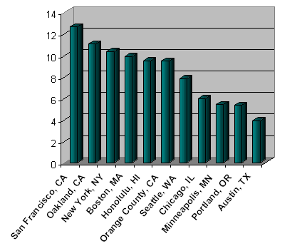
Here’s the actual data:
|
2005 Data
|
Median Housing Price
|
Median Household Income
|
Price-to-Income Ratio
|
|---|---|---|---|
|
San Francisco, CA
|
$726,700
|
$57,496
|
12.64
|
|
Oakland, CA
|
$487,300
|
$44,124
|
11.04
|
|
New York, NY
|
$449,000
|
$43,434
|
10.34
|
|
Boston, MA
|
$420,400
|
$42,562
|
9.88
|
|
Honolulu, HI
|
$481,000
|
$50,793
|
9.47
|
|
Orange County, CA
|
$623,600
|
$65,953
|
9.46
|
|
Seattle, WA
|
$384,900
|
$49,297
|
7.81
|
|
Chicago, IL
|
$245,000 |
$41,015
|
5.97
|
|
Minneapolis, MN
|
$226,900
|
$41,829
|
5.42
|
|
Portland, OR
|
$225,900
|
$42,287
|
5.34
|
|
Austin, TX
|
170,900
|
$43,731
|
3.91
|
What spawned my interest in this ratio was hearing media reports saying that in Portland, the median household can still barely afford a median-priced house. Really? I know it’s the end of 2006 now, but is even 5x salary affordable?
Although obviously this data doesn’t tell the whole story, especially with the huge price differences between neighborhoods and ignoring areas outside the actual city limits, but it’s still interesting. Are these ratios of 9-12 sustainable? I should try to find out what the ratios were like 15 or 30 years ago for the same areas.
I lived in Austin for a few years as a kid; I didn’t know housing was so relatively cheap out there, being both a college town and home to tech industry.
Check out the ratio in your area – Does it surprise you?
 The Best Credit Card Bonus Offers – 2026
 Big List of Free Stocks from Brokerage Apps
 Best Interest Rates on Cash - 2026
 Free Credit Scores x 3 + Free Credit Monitoring
 Best No Fee 0% APR Balance Transfer Offers
 Little-Known Cellular Data Plans That Can Save Big Money
 How To Haggle Your Cable or Direct TV Bill
 Big List of Free Consumer Data Reports (Credit, Rent, Work)
My small city in NJ – $353,400 / $49,325: 7.16
Austin is generally considered one of the most expensive places to live in Texas. If you spread the Austin analysis out to the whole county (Travis County), it drops to 3.56 which is still relatively high compared to Dallas County (2.91), Harris County/Houston (2.73), Collin County/Plano & Dallas Suburbs (2.62), Tarrant County/Fort Worth (2.47), Bexar County/San Antonio (2.24). The thought of spending in excess of three times my salary on housing would terrify me. Excluding my wife’s teaching income which will likely stop at some point, our home in Dallas is 2.41x my salary, but we also rent out our garage apartment to a friend so it lowers the effective costs. Good luck in your house hunting.
I’m better off than I thought…. 2.3 for my area! (I’m personally at a ratio of 1.19) The only drawback is I have to push around a wheelbarrow full of my extra cash.
Great idea for a comparison, but unfortunately unless they provide data for METROPOLITAN AREAS the data is meaningless. (Sorry to burst your bubble there.)
Here’s why:
This data is for POLITICAL CITIES, so they don’t account for the varying amount of suburbs included within the city limits of different cities.
Older cities (think New York, San Francisco, Washington DC, Philadelphia) have fairly compact boundaries pretty much set in stone 100 yrs ago or earlier that only capture the densest real estate within the entire metro area.
Newer cities (mostly cities outside of the northeast megalopolis) allowed for easier annexation of outlying areas so they would be able to tax the expanding population in the suburbs. Thus, they include much more less populated real estate with larger lots, less valuable land, etc.
Charlotte, NC, for example, has doubled it’s land area since 1980. San Antonio’s city limits cross through some completely vacant terrain that almost resembles desert. Although these two cities weren’t listed on that page, they demonstrate the point that comparing cities like this is like comparing apples to oranges.
(Sorry to get all map-geek on you. I am a geographer by profession…)
Portland seems really low. I suppose if you lived in SE Portland, you’d find houses in that price range but if you live in many of the other areas (places I’d actually want to live) the median house price seems pretty low.
My best friend owns a bunch of real estate around Portland and based on all of his property, SE is definitely the cheapest. He’s making a killing buying land there and building low end houses.
I think this ratio would be a bit more informational if, we also had the average appreciation gained by existing homeowners in another ratio. For instance, if a place in New York is now 450K, people in the area have owned their place for a certain amount of time with an average buy price of $250K, then they are not using 10.34 times their salary but 5.76.
I think two ratios side by side would give a complete picture. Like (10.34/5.76). You could see the appreciation and the affordability of an area in one snapshot.
I try not to look at the cheaper areas because it makes me sad 🙂 Don’t hurt your back with those wheelbarrows of money!
Thanks for the info Dan. Do you think it skews the housing prices more or the income? I’m guessing more the housing prices?
Most recent numbers for Portland are something like $270,000. Here are more numbers by neighborhood from a PDX RE blog. You’re right in that SE Portland is among the cheaper areas.
Average – Median = Area
$533,000 – $449,900 = Lake Oswego, West Linn
$450,800 – $376,000 = West Portland
$401,600 – $363,000 = Northwest Washington County
$356,000 – $320,300 = Tigard, Tualatin, Sherwood, Wilsonville
$353,800 – $307,500 = Milwaukie, Clackamas, Happy Valley
$323,100 – $285,000 = Oregon City, Canby
$303,000 – $265,000 = Northeast Portland
$280,700 – $258,000 = Hillsboro, Forest Grove
$278,400 – $251,000 = Beaverton, Aloha
$265,600 – $234,000 = Southeast Portland
$263,500 – $247,000 = Gresham, Troutdale
$244,600 – $234,900 = North Portland
San Francisco!! Holy $&!?* …You really need to tip your garbage man, mailman, etc if you live in that city!!!
Jonathan,
Enjoy the blog very much – my wife and I are both 26 and seem to have a similar background as you (both engineers), and have both been diligent savers over the past few years. Much of our “strategy” is similar to what you advocate here.
We live in Fort Worth, TX, where (according to the one site I found) the “average” housing price is $115,200 and median income is $43,271, which is a ratio of 2.66, much better than for Austin. However, we do have very high property taxes – approximately 3% per year, as does most of Tarrant County. So these taxes, no doubt, keep housing prices down. If they were only 2% or 1% like in most other parts of the country then you can bet that housing ratio would be closer to, or above, 3. Still, this is very cheap considering the prices elsewhere.
Seeing as Bryan calculated his personal ratio (this is another Brian by the way), ours was about 1.00 at the time we bought it in 2003. We bought for $120k and we made about that much at the time; now we make $150k and I don’t think our house is worth much more, maybe 130k, so that’s less than 0.9. This makes saving almost too easy, like Bryan mentions with his “wheelbarrow of cash.” I highly recommend it! Why spend more on a house when you don’t have to, particularly when you are double-income-no-kids. My wife and I have a short-term goal to have a net worth of $500k before age 30, and live such that we are living off of *one* salary, hopefully as long as we can (i.e. until we decide to have kids). Right now we’re a little ahead of schedule at over $300k, so hopefully it keeps up. But, no matter what, spending so little on your housing relative to what you make gives you the freedom to do pretty much whatever you want, and makes saving very simple.
In terms of what mimi suggests, I don’t think you can really capture “Excepted Appreciation” unless you consider a very long timeline. Do New Yorkers really see higher appreciation over 30 years than in, say, Austin? Perhaps, but using the last five years only would be an error as they have been unsustainable to say the least.
-Brian
Do you think it skews the housing prices more or the income? I?m guessing more the housing prices?
Well, it probably varies randomly. You could take a magic marker and a map of the metro area of any city, and draw some sort of shape around the most affluent area, or an area with higher than average poverty, or an area with the highest regional property values, or an area with lowest regional property values.
My point was that where the political boundaries actually were drawn and what populations they capture vary so much from city to city that such comparisons really should be done by entire metro area, not just the political city.
Say 100 years ago someone had decided Manhattan was the only borough officially able to vote for the Mayor of New York, and the other four boroughs were officially different political units outside of the city proper.
Or conversely, what if they had decided that the remainder of Long Island would count as the sixth borough of New York?
How would either of those scenarios have affected the statistics for New York cited in the original post? The political boundaries are almost arbitrary, so that’s why the comparison between cities is should be taken with a few grains of salt.
(Sorry for the long post, once I get started on geography and statistics….)
Did you guys notice that the more affordable a place is, the less household income? Although the income differences between the “rich” cities and “poorer” cities are much smaller than that of the house price differences, it seems to suggest that rich cities cost more to live in for a reason: people want to live there even if they will have to pay more.
Austin is the most expensive town in Texas because it’s naturally beautiful (in Texas standard) and culturally diverse (it’s country/folk music thing is very popular), and people in Texas generally want to live there. Same thing applies most fun towns like San Francisco and New York. LA is slightly different, it attracts tons of immigrants legal or illegal.
I know people from north east will never live in Texas even if they have business there. Same reason applies some Austinites will never move to Houston or Dallas…
Boise, Idaho = 3.3%
it would be fun to put in a line which represents the amount of housing debt a person should be able to afford (without fancy loan products). I know this is complicated by taxes, etc. I don’t remember offhand, isn’t it something like 2x annual salary?
Heather, I think the general guideline is 3x annual salary, though I’ve read in personal finance books that it shouldn’t be more than 2x if you want to save enough money.
Sadly for me, I’m in NYC working in Manhattan and despite making much more than the median income, I’m nowhere near being able to afford to buy anything other than a tiny studio.
I’m not surprised San Francisco’s at the top of the list. Most homes are $800K and above … there was one 3 bedroom for $700K
I was talking to a few people today about real estate and the consesus seems to be Austin is definitely affordable compared to the comments posted here. The woman at BofA who handles mortgage loans said a 2,000 square-foot house is like $169,000?? I thought that number was really low and unlikely. Maybe she was talking about a suburb of Austin.
That’s actually pretty high for only 2,000 sq. ft. I would bet that price would be pretty close to UTs campus or some other attraction. For example, I recently bought in an older suburb of Houston, not the nicest, but definately far from the worst. Price? 133k for 2800 square feet.
stmoneymusings,
Austin real estate market is very much like anywhere else in the nation. The price differences are huge from area to area. Austin downtown and west side are very expensive. You are looking at easily $300k to $400 on a relatively new 3/2 type houses. However, the suburb of Austin is still relatively close to downtown (downtown Austin is really small). Most new suburbs are within 20 minutes driving distance. There are several neighborhood east of downtown that used to be considered ghettos are not under huge real estate appreciation (100% per 3 years) because it’s close distance to the downtown.
Again, everything is oriented around downtown Austin. It’s night life and live music scene is very active, and UT Austin is right there. You can’t find anything below $300k within 10 miles of downtown, unless it ‘s a tiny condo.
thing is I think the median income is much higher than reported. I mean 22 year old management trainees already make about 40k and there are many more entrepreneurs than ever before that probably aren’t as accounted that make 6 figures. that’s why sales figures this year are still above average because people have money, contrary to the media that brainwashes 95% of people into thinking everyone is struggling.
I believe that is a result of the varying political boundary issue with these stats that I was talking about.
The stats for some of the cities include a larger proportion of the uber-wealthy within their political boundaries. For other cities a larger proportion of the wealthy technically live in suburbs and are therefore ignored completely in these stats.
Meanwhile, the inner city population will be included for ALL cities. We’re not comparing apples to apples with these stats.
This might be a double-edged type of “bragging” but my city (Indianapolis) is 2.83…
True – no mountains, ocean, ahnold but we do have programmers, affordable houses, and lotsa room!
2.31 here in the flyover states – outside of the major cities.
This is why I don’t mind living here. It’s less than an hour’s drive into KC, a day trip to Tulsa, a weekend to Chicago. Little polution and you can afford a house here!
My house is just a touch under the median range, but that’s because it is a 2 bedroom Arts and Crafts bungalow – perfect for one person. (/gloat *G*)
Unfortunately, a person with a median income does not own a median priced home because these stats do not exclude renters. I believe in NYC only about 30% own, vs. 70% rent, thus to really afford a median home the median owner should make the 85th percentile income, or a bit less as some renters make a lot of money, which is probably way higher than 43k.
Also, if you look at the chart, you will see that the cities with the higher pecentage of renters also have higher ratios on average.
I am possibly interviewing in the SF/bay area and would like someone to tell me the REAL scoop on how people afford homes. A realtor told me that “everyone” gets an interest-only mortgage, live there for 4-5 years, and you sell & jump to another property just before the balloon hits; repeat indefinitely. With a 12x ratio, I don’t see how you can even use every other paycheck for housing unless you have a shaky, subprime mortgage.
I don?t know the SF/bay market enough to give you the real scoop as it relates to that locality. However, If you plan to move up, move down, or move out in 3-4 years independent of a strategy to avoid a balloon payment, for example, you plan to assuredly advance in you career, then an adjustable rate mortgage will save you money. For this reason, you will be paying the lower rate and selling before the higher rate kicks in. A few caveats. A declining market will be the undoing of any such strategy as you would incur a loss on the property which is financially devastating unless you can cover it. 2nd, Closing costs upon each move or refiance will negate the savings to a great extent. In conclusion, it is better to plan for your housing needs and then select that financing that fits your plan. Using mortgages and scheduled moving is not a sound financial planning tool. Best of Luck.
People are buying more than they can afford and you have banks and mortgage company giving out loans base on their income but doesn’t meet the quaification. (Intrested only loan and ARM) Please people don’t tell me ARM is the way to go because you could save money. Thats what mortgage company wants you to get. Always stick with 30 years fix and 20%+ down. If you can’t do this then you can’t afford a home.
That why our real estate market is like this now!! People default on their loan because they lose their job and foreclouse their house.
NOT VERY RESPONSIBLE!!
really? it’s not responsible to lose your job? well maybe it’s not responsible for company head to lay off loads of employees that are making $12/hour while not decreasing his own six-figure income.