Via Calculated Risk, Doug Short has a series of charts comparing the movements of various bear markets. The one below compares the Dow starting in 1929 (Great Depression), the S&P 500 in 1973 (Oil Crisis), S&P in 2000 (Tech Crash), and the current bear market starting in 2007 (do we have a moniker yet?).
Click on image for larger version.
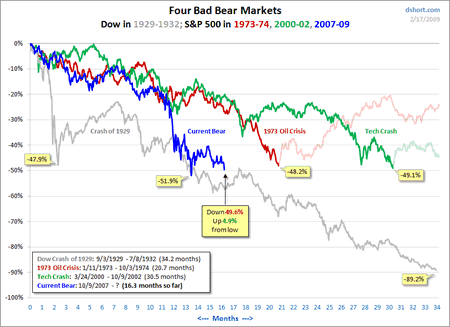
I wouldn’t read too much into them, although I do have a thing for pretty charts. 😉 If anything, I suppose we should be prepared for at least another year of fun:
Reinhart and Rogoff mention a three-and-a-half-year average peak to trough decline in equities for past financial crises. As of today, the market peak of October 9, 2007 was about 16 months ago — which would put us well shy of the half-way mark for the average crisis.
 The Best Credit Card Bonus Offers – 2026
 Big List of Free Stocks from Brokerage Apps
 Best Interest Rates on Cash - 2026
 Free Credit Scores x 3 + Free Credit Monitoring
 Best No Fee 0% APR Balance Transfer Offers
 Little-Known Cellular Data Plans That Can Save Big Money
 How To Haggle Your Cable or Direct TV Bill
 Big List of Free Consumer Data Reports (Credit, Rent, Work)
The average duration of bear markets since 1920’s has been about 18 months since the great depression. Since 1956 however the average duration of bear markets has been about fourteen months. The average decline since 1929 has been 38.2% versus 31.8% since 1956.
It has taken S&P 500 about 5.2 years on average to recover from to above its bear market highs since 1929. If we check the same parameter starting in 1956 the average recovery time from a bear market comes out to 2.8 years on average.
How about Credit or Housing Crash?
Your right about pretty graphs, its easy to try to find patterns and fool yourself.
Hopefully, most of your readers are responsible and follow a pretty simple truth for our economic system.
Best published by SNL a couple months ago:
If you dont have the money, dont buy it.
http://www.hulu.com/watch/1389/saturday-night-live-dont-buy-stuff?ref=patrick.net
And probably along those lines:
Dont invest the money in risky ventures if you cant afford to lose it.
Thanks for a great blog.
Looks to me like in recent years there is a psychological barrier at -50%…
Perhaps everyone likes a half off sale and buyers come in.
Isn’t the moniker “Credit Crunch” or “Credit Crisis”? Or maybe we can call it “The Great Greed Induced crash of 2008”
I guess Credit Crisis would work. I like the “Housing prices never go down! Crisis” better.
How about “The Great Awakening” — from rampant greed, overspeculation and overconsumption?
I thought the 2000 (not 200 as you have) crash we were calling the “dot com bubble burst”?
Thanks for the graphs, the market crash of the 30’s is the best as it shows how the market can fall 39% then rise 20% which pulls more investors in only to fall lower and raise another 20% then fall to low of 89%. I think we are a long way off from the bottom still as there will be more pain to come. The job losses are not slowing down, the housing forclosures is not slowing & the stimulas package is only going to put the US in deeper hole. Surprised gold is not even higher then what it is today.
It doesn’t seem to matter what type of charts are used for the present market. The financial markets are so heavily manipulated that no chart in the world could give you a clear direction.
The bankers and hedge funds also have many new tools, which were not available in the past. Dark Pools are used by mega wealthy bankers and Hedge Funds to surpass normal trading patterns in order to manipulate equity prices. Trying to compare past and present charts will never help to indicate future prices. The following article is a good example of the criminal syndicate we’re dealing with….
http://www.goldnewswire.net/gold-is-money#gold