Business Insider mined data from the Bureau of Labor Statistics and compared the state average salary and the national average salary for each job occupation. The single occupation with the largest percent difference is listed in the infographic below:

The income numbers are not adjusted for cost-of-living, but as that would apply to all jobs, you are still looking at the greatest outlier and thus some interesting outcomes. For example:
- The average annual salary for welders and cutters in Alaska is roughly $72,000. That’s 80% more than the national average of $40,000.
- The average annual salary for tile and marble setters in Massachusetts is roughly $75,000. That’s 70% more than the national average of $44,000.
- The average annual salary for physical therapists in Nevada is roughly $128,000. That’s 52% more than the national average of $84,000.
- The average annual salary for judicial law clerks in New York is roughly $111,000. That’s 104% more than the national average of $54,000.
I’m sure there are some economic (or “freakonomic”) explanations for some of these variations. It would also be interesting to run the same numbers for the worst paying job in each state, relative the national average.

 The National Association of College and University Business Officers (NACUBO) recently released their 2015 Tuition Discounting Study. While the average quoted “sticker price” tuition went up again as expected, so did the “tuition discount rate”.
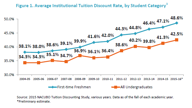


 The Best Credit Card Bonus Offers – 2026
 Big List of Free Stocks from Brokerage Apps
 Best Interest Rates on Cash - 2026
 Free Credit Scores x 3 + Free Credit Monitoring
 Best No Fee 0% APR Balance Transfer Offers
 Little-Known Cellular Data Plans That Can Save Big Money
 How To Haggle Your Cable or Direct TV Bill
 Big List of Free Consumer Data Reports (Credit, Rent, Work)