
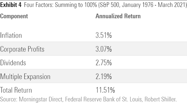
In the previous post How Much of Historical Stock Returns Is Due To P/E Ratio Expansion?, we saw how the S&P 500 historical average total return could be broken down into separate components of earnings growth, dividends, P/E multiple changes, and inflation. Here’s how it broke down from the period of January 1976 to March 2021:
I wondered: Is this a common breakdown? What about other periods of time? You may have seen charts showing the rolling historical 10-year total returns of the S&P 500. For example, 1980-1990, 1981-1991, 1982-1992, and so on. Here is such a chart:

Crestmont Research has generously shared the same total returns, but broken down into the separate components of earnings-per-share (EPS) growth, dividends, and P/E multiple changes. As they put it:
There are only three components (excluding transaction costs and expenses) to the total return from the stock market: dividend yield, earnings growth, and change in the level of valuation (P/E ratio). To assess the potential returns from stocks for the next decade, this analysis presents the total return and its components for every ten-year period since 1900.
Observations. Despite my discovery that it didn’t take 25 years to recover from the 1929 crash, notice that the Great Depression was the only period where corporate earnings consistently dropped for an extended period. We do see the dividends still being paid out, but experiencing your business make less and less earnings for years must have been very difficult.
Since approximately the time of World War II, the overall profits of the S&P 500 companies have risen in every single 10-year period. Meanwhile, the dividend yield was also positive, although it has experienced a gradual decrease over time. If you just look at those two components added together, that is quite impressive.
Finally, we see that the component with the wildest swings by far is the Price/Earnings ratio. From this visualization, it looks like huge “waves of optimism” and “waves of pessimism” that are end up causing most of the overall volatility in total return. Right now, we appear to be still riding one the waves of optimism.
 The Best Credit Card Bonus Offers – 2026
 Big List of Free Stocks from Brokerage Apps
 Best Interest Rates on Cash - 2026
 Free Credit Scores x 3 + Free Credit Monitoring
 Best No Fee 0% APR Balance Transfer Offers
 Little-Known Cellular Data Plans That Can Save Big Money
 How To Haggle Your Cable or Direct TV Bill
 Big List of Free Consumer Data Reports (Credit, Rent, Work)
Speak Your Mind