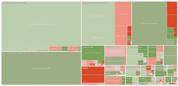
Here’s another infographic from the New York Times illustrating the proposed budget for 2012. Rectangles are sized according to the proposed spending. Color shows severity of cut or increase from 2010 (green increase, red decrease).
If you like such visualizations, check out Death and Taxes 2011.
 The Best Credit Card Bonus Offers – 2026
 Big List of Free Stocks from Brokerage Apps
 Best Interest Rates on Cash - 2026
 Free Credit Scores x 3 + Free Credit Monitoring
 Best No Fee 0% APR Balance Transfer Offers
 Little-Known Cellular Data Plans That Can Save Big Money
 How To Haggle Your Cable or Direct TV Bill
 Big List of Free Consumer Data Reports (Credit, Rent, Work)
This country spends to much money.
It’s a nice graphic, but I wish they had partitioned mandatory and discretionary spending. The distinction is quite important in the current policy debate, since cuts in discretionary spending are a whole lot easier.
Now that is a cool and informative graphic! I’m predicting that health and services potion will shrink in the coming months as the House slices and dices away at Obama’s health care overhaul. And don’t get me started on SS… Here’s a question for other readers: Do you factor in SS benefits into your total retirement portfolio?
@Ken Feyl
They do — click on the links in the left hand margin to hide one or the other. Should show you what you’re looking for.
@Jon
I’m young — 25 — and have resigned myself to never seeing a penny of SS. If I get any, I’ll be pleased as punch. It’ll be a nice surprise.
Same here Greg, I’m 23 and discount it from my overall retirement portfolio. Even if I did get it, it wouldn’t even be comparable to my disbursements from the Roth and 401k. But yes, I’d be ecstatic if I got any social security!
I love the graph its kinda cool.
Put that on my VISA
$1+ trillion/year on medicare and medicaid? This is why we need reform in those areas … but apparently that’s “socialist”