I’ve been trying to find a pie chart listing the spending breakdown of the average American to provide a frame of reference for our spending pie chart last year, and here is the closest I could find. It’s in terms of pre-tax numbers, and I added the percentages for clarification:
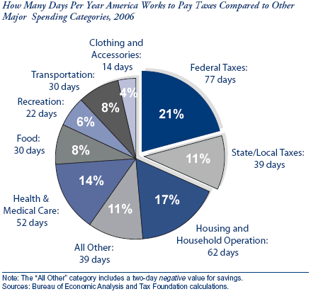
The chart was taken from an article by the Tax Foundation think tank, whose stated mission is to “educate taxpayers about sound tax policy and the size of the tax burden borne by Americans at all levels of government.” However, there is some argument about the accuracy of these numbers.
Note that there is no slice for Savings, as our savings rate is negative according to their calculations. 🙁
 The Best Credit Card Bonus Offers – March 2024
 Big List of Free Stocks from Brokerage Apps
 Best Interest Rates on Cash - March 2024
 Free Credit Scores x 3 + Free Credit Monitoring
 Best No Fee 0% APR Balance Transfer Offers
 Little-Known Cellular Data Plans That Can Save Big Money
 How To Haggle Your Cable or Direct TV Bill
 Big List of Free Consumer Data Reports (Credit, Rent, Work)
It’s depressing to see the taxes translated into days– 121 DAYS I am working for the government. 1/3 of the year. Every third day. Anyway you cut it, it’s ugly.
Interesting this about this chart– it totals 365 days. I don’t know many (any) people that work that many days a year. For me, it’s more like 240 work days per year.
Lies, damned lies, and statistics.
Those “days” seem to serve nothing more than an irrelevant, emotional thrust to their core argument that we pay too much in taxes. “Wow, for 77 days each year the Federal government OWNS me!” It’d probably still sound like “too much” if it was 50, 25, even 10 days.
From your own link, it sounds like their study is flawed and quite possibly politically motivated. Though perhaps the proportions of the other spending categories versus one another are accurate.
‘core argument that we pay too much in taxes’
They are right.
i do find it funny that we dont save as a nation and yet u save a whopping 43%….thats even better than my goal of a 1/3rd….wow….
do u think 43% is sustainable over a long long period of time?
I have been upset with the tax burden since my first real check after graduating from college. There is something wrong when most Americans are paying 1/3 of their before and after tax income to the government. This is more than most spend on housing whether it is a mortgage payment or an apartment.
For those who doubt the chart regarding taxes, take a look at your check. Add federal income tax, SS, medicare, state income tax and local income tax if applicable. Look at your phone bill, electric bill, car fee or tax each year and include inspection sticker if applicable, gasoline tax, home property tax. Some states even have sales on groceries, and I don’t mean coke and candy, I mean meat and vegtables as well.
Don’t forget the taxes that companies must pay (property tax, federal and state corporate taxes, payroll tax, minimum wage laws) before making a profit on the product or service. You are paying that to!
I’m sure the real tax burden for most Americans is almost 50%.
I’ve been making less than the national median income for sometime now and upset at the wealth destruction from not only taxes but also the horrendous inflation.
>I?m sure the real tax burden for most Americans is almost 50%.
Well, somehow we have to sustain the dumb government of ours, but that’s a discussion for another blog.
An interesting breakdown nevertheless.
Dima
You have to remember that we do get something for our taxes, like protection and other services. You can still argue that it’s too much, but it’s not like you aren’t getting something back for the money you are paying in.
Your chart above factors in taxes separately (sales taxes too by my guess), but your personal income pie chart does not.
The BLS publishes all kinds of interesting statistics. They break down spending by region of the country and income quintile, homeowner/renter, for example. Looking at their data I come up with for West coast residents, shelter 20%, utilities 5%, transportation 17%, food 12%, some others: furnishings 3%, clothes 4%, entertain 5% (of post tax dollars): http://www.bls.gov/cex/csxann05.pdf
Published numbers for personal savings do not break down by age group (retirees are net spending), and maybe also neglect to include 401(k) contributions. The San Francisco Chronicle estimates the “true” savings rate is 2-3%.
So comparing your chart with these numbers, I figure that the single highest contribution to your high savings rate is low transportation spending.
@Mike H
I think that the point that some of the above commenters were making is that the tax burden is too large, not that there shouldn’t be a tax burden. Any reasonable person would agree that taxes are necessary so that we can pay for roads, for example. Protection, in both the foreign and domestic sense, is another viable reason for taxes.
I do believe that the tax burden is too large, especially when it is used as a vehicle for the redistribution of wealth.
@Andrew
You’re comment has a socialist ring to it, but in any case I certainly wouldn’t complain if my tax burden was 10 or 25 days (3 to 7 percent). That wouldn’t seem like “too much” at all. Of course, 40% or so of the people in this country don’t even pay that much. In fact many are actually “tax receivers.”
@Jonathan
Sorry for straying a little off topic! Been reading your blog for a while and I really enjoy it.
Of course this data is grossly misleading since it uses the “average”. In anything having to do with money it’s always better to use the median because the distribution is biased to the right by a large amount.
From that link: “In fact, the CBO data indicate that families in the middle of the income spectrum will pay 5.4 percent of income in federal individual income tax this year. In the Tax Foundation’s terms, that means it will take only until January 20 for the typical household to pay its federal income taxes. Congressional Budget Office analyses show that three of every four families are paying less than 10 percent of their incomes in federal individual income taxes.”
To take an example, a family of 4 with $150k in income and $15k in a 401k and no other deductions (e.g., mortgage) would pay 21% federal taxes. This would be considered a fairly well-off family by any standard.
Heather, very good info as always, thanks! It’s know it would be hard to compare directly to ourselves. Hmm, we’d be in the about 80-90th percentile of income for 2005 data, but that average household has 3.0 people in their consumer units (2 of them earners), so technically we should be spending less since we only have 2 people.
I’ve been trying to gather data on the whole neglecting 401(k)s problem, and wonder how that balances out with the disappearance of pensions, which also I believe are not counted as personal savings. I think a true savings rate of 2% might be right, but I also think the spread of savings across all income groups is now much more tilted as well.
The way things are usually defined, I’m not sure that a low national savings rate is necessarily as bad as it first appears. First of all, as has been pointed our before, the “savings” stated in most statistics does not include pensions, capital gains, future social security benefits, and a whole host of other items. Second, the wealthier we become as a society means the less the savings will probably come from the categories that are currently measured, which exaggerates the first issue.
I actually have no problems with how these statistics are measured…I just find that the popular press portrays the results as something they are not. The slant always seems to be that if someone has a zero savings rate all their life, they will certainly be broke when they retire, and thus, if we as a nation have a zero savings rate, then our society will soon be destitute and penniless.
Think about it. Suppose someone is given $10K when they are 10 years old. If that person doesn’t touch that and receives an 8.75% return, it will be worth more than a million dollars at age 65. Yet he/she never saved anything! And if people work their whole life in a good job, but “save no money” as defined in the usual studies, they may still be wealthy. They will have social security benefits, possibly a penion, possibly a lot of employer stock, possibly a ton of equity in their house with no mortgage, possibly a business that they built, and possibly a lot of other things. All done with a “zero savings rate”.
Don’t get me wrong. I’d be the last person to encourage anyone to save less. I strongly encourage people to save more. My only point is that the “national savings rate is zero” mantra that is repeated over and over again is not telling the whole picture of how wealth is accumulated and preserved in this country.
Times change. Eventually the same statistics calculated the same way they were calculated 30 years ago do not tell the same story they did 30 years ago. A few years back, people were alarmed because the amount of money in “passbook savings accounts” was dropping, only to eventually find out that all it meant was that people now had a preference for money market funds and other vehicles. Now there is an obsession on Wall Street that corporate profits as a percentage of GDP is somewhat higher than it has ever been, and thus profits must drop back down. But what is that number really telling us? Are profits really abnormally large? Or is the percentage of businesses that are incorporated simply larger now? Or something else? Time will tell…
I am new to the whole financial health game. I am 26, have a wife 2 young kids, house and a student loan. I made 75k last year between my day job and part time business, and I ended up paying 8% taxes at the end of the year after I did my taxes (federal + state combined)? I ended up having 40k+ in deductions? Just wanted to share my experience from this past year, great site! I’m learning a ton.
There’s no question the TaxFoundation is “politically” motivated. Though not necessarily to a political party just any party that favors lowering taxes. I don’t want to get into a big debate on taxes having just been in one, but I do want agree with Andy’s point about averages. The chart in itself doesn’t tell me enough – where’s the footnote? Does the all other include savings? It could be severely biased if the “all other” doesn’t include savings. The high taxes paid by high income individuals wouldn’t be counter balanced by a high savings amount as well. I don’t know if that’s the case or not, but I think it’s always good to really look at the underlying statistics before jumping to conclusions.
So I think that we’re all agreed that this really needs to be about 5 different charts, divided by quintile of income. Unfortunately, the USA today (or whatever the paper of the day may be) only has space for one little chart on the cover of their finances section. So there you have it, 5 somewhat meaningful charts are supplanted by 1 pretty much useless chart. And I mean really, who has a press release with multiple useful charts? Then you’d have to let poor quality journalsts actually select a chart rather than show us the same chart that the other 5 TV stations are showing.
Either way, I’m actually looking at this from a Canadian perspective and it definitely provides some insight. You see, we Canadians are gifted with “free” healthcare, which is then “pleasantly offset” by increased taxes. As such, we also have the pride of calling ourselves the most heavily taxed developed nation (or somesuch), but it is nice to use some numbers to compare. You see our provincial tax is about equivalent to your state tax (it varies of course, like yours) and our income tax is about 10% higher. Of course, that health and medical care section is about 10% lower. So on an income tax comparison, it doesn’t seem that we’re very far off.
Of course, everyone in Canada (except oil-rich Alberta) is paying both a provincial tax (6-8%) on goods and a federal tax (6%) on goods and services. So the final number is a little higher, but the difference does not seem outrageous.
However, our RRSP (Registered Retirement Savings Plans) are very similar to your 401(k), except that they are individually managed, rather than employer-sponsored (with an annual contribution limit of about 19% + unused portions from prev years). So the two are most likely a wash, which would then makes taxes in the states not terribly far from Canadian taxes (though we’re still worse).
It is worth noting though, that an equivalent Canadian pie chart would definitely include RRSPs and Pensions as “savings” as they come directly off of the pay-cheque, whereas this graph clearly ignores such things.
These figures are totally misleading because the authors are using the mean to look at the amount paid but the median to determine what an “average” family is. If 98 families make $40,000 and pay $5,000 in federal income tax (12.5%, totaling $490,000) and 2 families make $1M and pay $250,000 in federal income tax (25%, totaling $500,000), the mean average $9,900 tax bill each family has to pay would take just shy of 25% of the year for the “average person” (i.e., the median $40,000 family) to pay off. But that’s not what those $40,000 families are paying–they’re paying 12.5%.
I think by including a negative value of two days for savings, they mean that since the chart is showing what people are spending in terms of days, they’d have to use negative days in order to show money that people saved instead of spent. Do I make sense?
Thanks for that link, Heather. Looking at all the scenarios, it was easy to find one that looked like me (the one-earner household also had a similar income and age).
It was also fun to compare people before and after age 65. At first I was surprised to find that they spend less on everything but health care, not just housing like I would have expected (since they are more likely to have paid off their house), but then I noticed they have a much lower income. They spend as though the loss in income is only barely made up for with the gain from retirement investments.
They only spend 24% more on health care, which surprised me. I figured double or triple.
I also enjoyed comparing the transportation costs of folks living in the central urban areas ($6935/year), other urban areas (suburbs?) ($9038/year) and rural areas ($8150/year).
This is a nice tool for estimating some changes in costs based on lifestyle changes (such as moving from a suburb to the city or retiring) and other costs such as seeing how much you should be saving each month to buy your next car for cash (look at the average amount spent on car purchases for some group comparable to you).
the goverment should learn to adjust and cut spending just like everybody else in hard economic times. goverment needs to be run like a small buiseness. work harder and more efficent . we as tax payers see state and federal goverment employees , think about people all the county, township , state , federal, police officers, fire department, dmvs, social services, welfare, millions of jobs created by tax payers moneyswith big benefits and retirement plans all funded from your pockets. the moral is if these people were working for you how long would it take for you to fire them or say lets pick up the pace and be more productive less goverment red tape would make everything run smother less goverment is a better goverment
An interesting time series chart from the early 1900’s. I can not confirm or deny the figures, but if it is true… it’s a very interesting look at consumer spending trends at a high level.
adage.com/images/random/consumerchart011607.pdf