
Investment advisory firm Research Affiliates has updated their interactive Asset Allocation tool, which now provides estimates of expected returns for more than 130 asset classes and model portfolios. There are two expected return models, “valuation-dependent” and “yield-plus-growth”. In addition, you can input your own custom asset allocation.
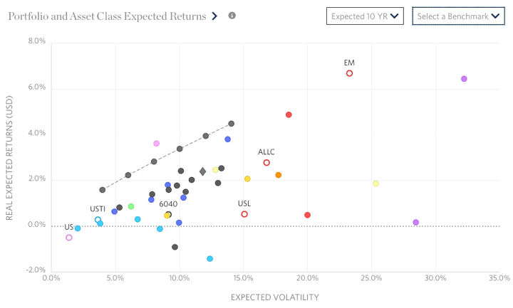
My initial reaction is that while the tool got new bells and whistles, it also became more confusing to navigate and harder on the eyes. Here’s a screenshot of their scatter plot showing the expected risk and return for several asset classes under their valuation-dependent model.
I created a custom portfolio “CustomMMB” using my current portfolio asset allocation and it is charted below on their risk/return map. In a separate window (not shown) you can see how each individual asset class contributes to the total expected return.
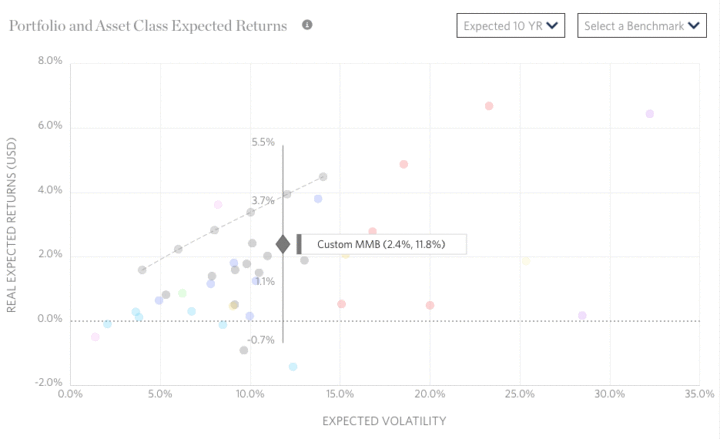
As you can see, my portfolio did not offer the maximum expected return for its risk level. The RA efficient model portfolio that did includes an exotic mix of asset classes, including Emerging Markets bonds (non-local currency), Bank Loans, US Private Equity, European Private Equity, and direct investments into US Commercial Real Estate (not through REITs). Unfortunately, I’m not even sure how to access many of those asset classes.
I appreciate that they freely share their research methodology and results, specifically covering the valuation perspective. US Equities have historically high valuations, but interest rates are also at historically lows. The next 10 years should be interesting…
Another portfolio analysis tool that lets you input your specific asset allocation is PortfolioCharts.com Safe Withdrawal Rate calculator. This Research Affiliates tool says my expected 10-year real return is only 2.4% (equates to a nominal expected return of 4.6%). The PortfolioCharts.com tool says the same personal asset allocation has a historical perpetual withdrawal rate of over 4% over a 40-year timeframe.
 The Best Credit Card Bonus Offers – March 2024
 Big List of Free Stocks from Brokerage Apps
 Best Interest Rates on Cash - March 2024
 Free Credit Scores x 3 + Free Credit Monitoring
 Best No Fee 0% APR Balance Transfer Offers
 Little-Known Cellular Data Plans That Can Save Big Money
 How To Haggle Your Cable or Direct TV Bill
 Big List of Free Consumer Data Reports (Credit, Rent, Work)
I don’t have much faith in these predictions of future real returns for every minute asset class (Europe LBO?). Seems to be a lot of guess work involved. I wonder what their track record has been over the last 10 years. “The most hated bull market in history” is a phrase that’s been thrown around the last couple of years. I suspect the term is indicative of how accurate the professional predictions have been. “The market is too expensive!” ,”Valuations are inflated because of monetary policy!”. On the flip side, I’ve also read that “the market likes to climb a wall of worry” and that negative market sentiment is actually a positive indicator. This seems to have been proven true for the last few years.
As for me, I prefer to tune most of it out and stick with pretty much the same allocation I have had for the last 15 years. It has served me well so far.
It’s interesting to compare Portfolio Charts, which is based on historical data, to the RA tool, which is based on future expectations. Some of the best historical portfolios shown on Portfolio Charts have dreadful future expected returns using the RA tool due to mean reversion.