Free Websites Reveal Your Address History and Names of Relatives (How to Opt Out)

My Money Blog has partnered with CardRatings and may receive a commission from card issuers. Some or all of the card offers that appear on this site are from advertisers and may impact how and where card products appear on the site. MyMoneyBlog.com does not include all card companies or all available card offers. All opinions expressed are the author’s alone.

mag

Updated 2019 with more websites. “People would care more about privacy if they knew how exposed they already are online,” says Geoffrey A. Fowler in his WSJ article Your Data Is Way More Exposed Than You Realize.

I hear this all the time: “I have nothing to hide.” The truth is, pretty much everybody does something online they have reason to keep private.

I would have to agree. These days, it just takes a few clicks to find out your age, current and past addresses, phone numbers, and the names of your parents, siblings, children, cousins, and in-laws (and thus all of their information). Try entering your own name and city into one of the first few websites on this list:

  • Peoplefinders.com – Public access to your current and past addresses, phone numbers, relatives and associates. Opt out at www.peoplefinders.com/manage.
  • InstantCheckMate.com – Public access to your current and past addresses, phone numbers, relatives and associates. Opt out at www.instantcheckmate.com/opt-out.
  • FamilyTreeNow.com – Public access to your current and past addresses, phone numbers, relatives and associates. Opt out at www.familytreenow.com/optout.
  • TruePeopleSearch.com – Public access to your current and past addresses, phone numbers, relatives and associates. Opt out at www.truepeoplesearch.com/removal.
  • MyHeritage.com – Must e-mail them at privacy@myheritage.com to remove information.
  • Geni.com – Must e-mail them at privacy@geni.com to opt out.
  • Spokeo.com – Public/paid access to birth month, email, current and past addresses, phone numbers, relatives, social networks and court records. Opt out at spokeo.com/optout.
  • Acxiom is a data broker that uses information to target ads and marketing. I found some unique data on there, although supposedly it’s not public (just up for sale). Opt out at acxiom.com/optout.

Opt out. For most of these websites, there is an opt-out option hidden in either their “Terms & Conditions” or “Privacy Policy” pages. Even though many of these sites appears to be clones of each other, you must opt out of each of them individually. The only “good” news is that where available, my opt out requests were fulfilled and I can’t find those records even a year later. It’s like stomping a cockroach but knowing there are more that you just can’t see.

Here are some related resources:

Facebook and Google serve as bottomless vacuums of your personal data. These tools help show you exactly what they keep.

  • StalkScan.com – Not public. Just links to specific parts of your own Facebook profile. Find out everything that Facebook stores about you, even if it’s hard to find otherwise.
  • Google Maps Timeline – Google may be tracking your location all day long and keeping records forever. Not public. You can log in and request your data to be deleted.
  • Google My Activity – Google may be tracking every search and your web browsing history and keeping records. Not public. You can log in and request your data to be deleted.

Free Consumer Reports. You can also get a copy of your data stored at official consumer reporting agencies via the Fair Credit Reporting Act (FCRA).

My Money Blog has partnered with CardRatings and may receive a commission from card issuers. Some or all of the card offers that appear on this site are from advertisers and may impact how and where card products appear on the site. MyMoneyBlog.com does not include all card companies or all available card offers. All opinions expressed are the author’s alone, and has not been provided nor approved by any of the companies mentioned.

MyMoneyBlog.com is also a member of the Amazon Associate Program, and if you click through to Amazon and make a purchase, I may earn a small commission. Thank you for your support.


Retirement Nest Egg Calculators: Running Out of Money vs. Running Out of Time

My Money Blog has partnered with CardRatings and may receive a commission from card issuers. Some or all of the card offers that appear on this site are from advertisers and may impact how and where card products appear on the site. MyMoneyBlog.com does not include all card companies or all available card offers. All opinions expressed are the author’s alone.

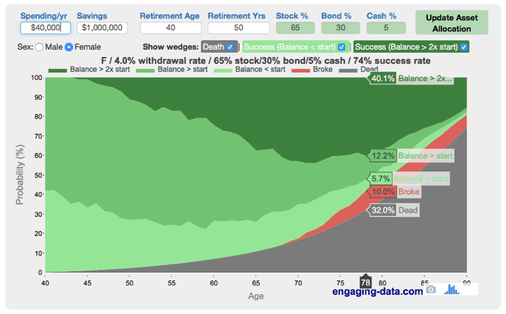
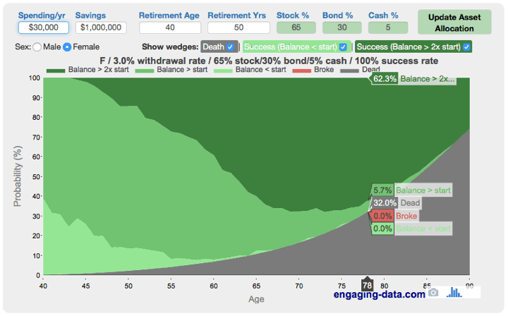
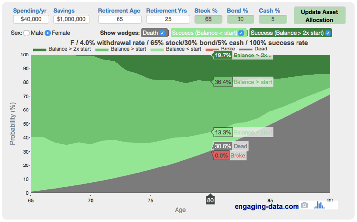
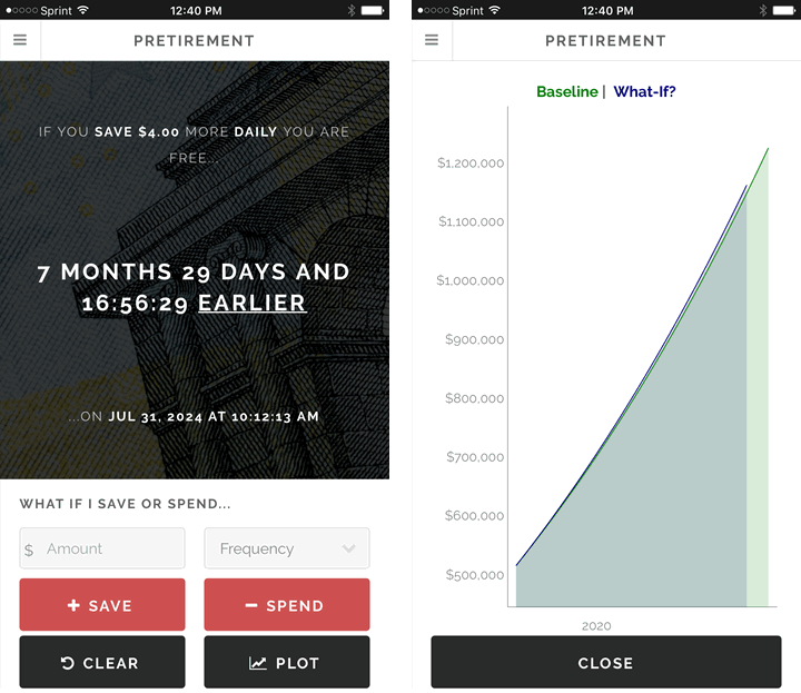
If you have researched retirement at all (early or otherwise), you’ve probably ran across various retirement calculators online. You input how much money you have (or plan to have), your asset allocation, and it spits out some numbers. This Vanguard Retirement Nest Egg Calculator is a good example of a simple version.

Let’s try an example. If I am 40 years old and thus assume I have up to 50 years left in retirement, and I want to maintain a 4% withdrawal rate ($40,000 a year from a $1,000,000 portfolio that is 65% stocks/30% bonds/5% cash), the tool uses Monte Carlo simulations to calculate that I have an 80% chance of lasting 50 years.

There is effectively one output: the odds of not running out of money. Either you still have at least a dollar, or you don’t. In my example, I have an 80% chance of having $1 or more at age 90.

But what if you also considered the odds of running out of time? Yes, that’s a euphemism for dying. (Ever notice how many of those we have?) In another neat tool from Engaging-Data.com, Will Your Money Last If You Retire Early? adds some helpful nuance to this analysis. You input the same types of information, but now in any given year you are provided the overall odds of each of these things happening:

  • Red – You are alive, but ran out of money.
  • Light green – You are alive, with less money than you started with. (Kinda nervous?)
  • Green – You are alive, with between 100% and 200% of what you started with. (Nice and comfy.)
  • Dark green – You are alive, with over 200% of what you started with. (In hindsight, I didn’t need to save so much…)
  • Grey – You are pushing up daisies. (In hindsight, maybe should’ve retired earlier…)

Here are sample results for the early retirement scenario above at 4% withdrawal rate (age 40, retirement horizon 50 years, $40k from a $1m 65/35/5 portfolio). I picked the female mortality table – if you have a male/female couple, it’s safer to pick the person likely to live longer.

There’s an angry streak of red where I’m broke. Of course, there’s a bigger streak of grey where I’m not breathing.

Here’s the same scenario, except with a lower 3% withdrawal rate ($30,000 a year from a $1,000,000 initial portfolio):

That change got rid of the red, but there is a lot of dark green. (1% makes a big difference.)

Here are sample results for a more traditional retirement scenario: (age 65, retirement horizon 25 years, $40k from a $1m 65/35/5 portfolio)

As a financially conservative person, these charts help illustrate why I prefer working with a 3% safe withdrawal rate for early retirement (50 and under) and 4% safe withdrawal rate for traditional retirement (closer to 65).

My favorite part of this tool is that it makes you take into account your mortality. It’s not all about staying above $1 in the bank, but also about maximizing your years of freedom. If you’re 40, you have a 10% chance of dying before even reaching 65. (This is why most people know someone who died shortly after retirement.) Is it better to have zero chance of broke and be 70, or 5% chance of broke and 60 with 10 more years of retirement (and 10 fewer years of work)? It is better to live a little more luxuriously for shorter time, or a little more frugally for a longer time? Playing around with all the different input variables might help you weigh the options.

My Money Blog has partnered with CardRatings and may receive a commission from card issuers. Some or all of the card offers that appear on this site are from advertisers and may impact how and where card products appear on the site. MyMoneyBlog.com does not include all card companies or all available card offers. All opinions expressed are the author’s alone, and has not been provided nor approved by any of the companies mentioned.

MyMoneyBlog.com is also a member of the Amazon Associate Program, and if you click through to Amazon and make a purchase, I may earn a small commission. Thank you for your support.


How Much Do You Need To Save For College? Vanguard 529 Calculator

My Money Blog has partnered with CardRatings and may receive a commission from card issuers. Some or all of the card offers that appear on this site are from advertisers and may impact how and where card products appear on the site. MyMoneyBlog.com does not include all card companies or all available card offers. All opinions expressed are the author’s alone.

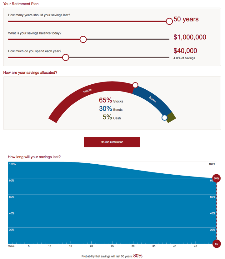
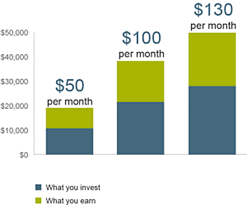
Thinking about 529 plans and like playing around with interactive calculators? This Vanguard tool helps you visualize how much you’ll need to save for college and how changing up a specific factor would affect your results. It adjusts for age, contributions, investment returns, tuition inflation, and even looks up the current cost of your favorite university. A formal report is spit out with lots of charts, just like a financial advisor might create for you. Here’s a sample screenshot:

Tuition inflation is something that I think is hard to predict. However, I couldn’t think of anything better than accepting the default assumptions that investment return will only barely outpace tuition inflation.

If you’d rather have a quick, simple scenario, check out this Vanguard article on the power of automatic savings. If you put away $130 a month automatically every month for 18 years, at a 6% return you’d end up with $50,000. Putting away $50 a month reliably would get you to $20,000.

Nearly half of your final amount would be due to investment growth, which thanks to the 529 plan can be tax-free when used towards qualified educational expenses.

I’m still in the camp that retirement should be prioritized over college savings, but I definitely understand the parental instinct to provide the best educational opportunity possible. I’m still pondering the idea of targeting funding college with 1/3rd savings, 1/3rd spending from current income, and 1/3rd grants/scholarships/loans.

Finally, here is another set of handy Vanguard tools, a 529 Plan Interactive Comparison Map and Tax Deduction Calculator.

My Money Blog has partnered with CardRatings and may receive a commission from card issuers. Some or all of the card offers that appear on this site are from advertisers and may impact how and where card products appear on the site. MyMoneyBlog.com does not include all card companies or all available card offers. All opinions expressed are the author’s alone, and has not been provided nor approved by any of the companies mentioned.

MyMoneyBlog.com is also a member of the Amazon Associate Program, and if you click through to Amazon and make a purchase, I may earn a small commission. Thank you for your support.


Readwise: Turn Your Kindle Highlights Into a Personalized Email Newsletter

My Money Blog has partnered with CardRatings and may receive a commission from card issuers. Some or all of the card offers that appear on this site are from advertisers and may impact how and where card products appear on the site. MyMoneyBlog.com does not include all card companies or all available card offers. All opinions expressed are the author’s alone.

readwise0

I love physical books, but my favorite thing about Kindle books is the highlight feature. It’s really hard to remember everything that you read. This is why I try to condense my handwritten notes in my book reviews. I’ll let The Atlantic explain Why We Forget Most of the Books We Read.

Readwise syncs with your Kindle highlights and then sends you a daily digest with five highlights taken from books that you have read. You’ll need to install a browser extension. It can include Kindle highlights done outside of eBooks, iBooks, Instapaper, and PDFs.

Here’s an example of what I was sent the other day. (I scaled it back to weekly emails.) Much of my reading is about either finance or biographies. A lot of personal finance is in the “simple but not easy” category, so it’s helpful to keep things fresh. Some of the highlights lack context, but I have found most to be useful.

The Elements of Investing by Burton G. Malkiel, Charles D. Ellis.

Rebalancing will not always increase returns. But it will always reduce the riskiness of the portfolio and it will always ensure that your actual allocation stays consistent with the right allocation for your needs and temperament.

Skating Where the Puck Was by William J Bernstein.

To complete the picture, the traditional source of portfolio diversification, international equity exposure, has likewise tarnished; with increasing market globalization, the correlations among equities around the world have crept ever higher.

The Most Important Thing by Howard Marks.

Risk means uncertainty about which outcome will occur and about the possibility of loss when the unfavorable ones do.

The Last Lecture by Randy Pausch and Jeffrey Zaslow.

“…The brick walls are there to stop the people who don’t want it badly enough. They’re there to stop the other people.” I was a thirty-seven-year-old bachelor when Jai and I met.

How does Readwise make money? From what I can tell, right now it is free during “beta”. They have a VIP level that cost $5 a month or $50 a year. I don’t think I would pay that much, to be honest. My suggestion? At the end of each email, they provide a book recommendation along with a quote. They should make that an Amazon ad, seems like a perfect fit.

Bottom line. If you have a decent library of Kindle highlights, check out Readwise and let it dig up nuggets of gold and send it to you daily or weekly. Get more mileage out of those notes and highlights.

My Money Blog has partnered with CardRatings and may receive a commission from card issuers. Some or all of the card offers that appear on this site are from advertisers and may impact how and where card products appear on the site. MyMoneyBlog.com does not include all card companies or all available card offers. All opinions expressed are the author’s alone, and has not been provided nor approved by any of the companies mentioned.

MyMoneyBlog.com is also a member of the Amazon Associate Program, and if you click through to Amazon and make a purchase, I may earn a small commission. Thank you for your support.


Free Social Security Calculator Tool: Estimate Your Benefits

My Money Blog has partnered with CardRatings and may receive a commission from card issuers. Some or all of the card offers that appear on this site are from advertisers and may impact how and where card products appear on the site. MyMoneyBlog.com does not include all card companies or all available card offers. All opinions expressed are the author’s alone.

socialsecuritycard
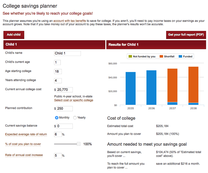
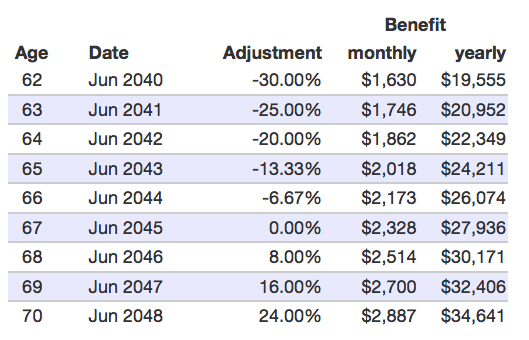
There are some (mostly young) skeptics, but Social Security should remain a major pillar of your future retirement income. For over 60% of current retirees aged 65+, Social Security makes up the majority of their income. Therefore, it may be worth spending some extra time figuring out how it works.

First, you should sign up for a mySocialSecurity account at SSA.gov. For many people, this is the only way to view your current benefit eligibility as they are phasing out those annual green paper statements. You will find some interesting information including eligible earnings history. (For example, I earned $1,814 in the summer after high school.) Also, if you claim your account first, it prevents an potential identity thief from opening an account in your name and stealing your benefits.

Second, you can check out this unofficial Social Security helper tool to test out different scenarios. Created by an Google engineer named Greg Grothaus in his spare time, the site takes your earnings history and uses Javascript to analyze it within your browser. No data is submitted over the internet. Found via The Finance Buff.

Here are some scenarios you might test out:

  • What happens to my benefit if I earn additional wages for several more years? What if I stop working forever?
  • How does my benefit change as my total earnings grow during my lifetime?
  • What happens if I choose to take my benefits early? What if I delay and take them late?

You might not know that your eventual benefit is based on your top 35 annual indexed earnings values. Indexed earnings are simply the payroll wages you earned in a year multiplied by a number that adjusts for wage growth. I personally don’t even have 35 working years yet, so every additional year I work will be in my “Top35” and increase my future payout. Here are some charts based on my earnings history:

If I stop working immediately and then start taking benefits at my “normal” retirement age of 67 years, I will earn $1,666 per month ($19,992 per year). If I start taking money at age 62, I will earned a reduced $1,166 per month ($13,994 per year). Here’s the full chart:

sstool1

If I keep working for another 20 years at $50,000 per year, then my age 67 benefit will increase to $2,328 per month ($27,936 per year). If I start taking money at age 62, I will earned a reduced $1,630 per month ($19,555 per year). Here’s the updated full chart:

sstool2

Working/waiting an extra year may increase your payout enough to change your lifestyle significantly. An extra $100 per month may not seem that much, but that’s an extra $1,200 each year for the rest of your life that increases with inflation. If you don’t have adequate income from other sources, that could cover your medication copays for the year. It could be the difference between staying home and doing a video chat vs. flying and playing with your grandkids in person each year.

If you are on the early retirement track, that inserts a bunch of zeros in your “Top 35”. With this calculator, you can see how much that actually changes your eventual payout. Even if I continued to work another 25 years at $100,000 per year, my annual benefit at age 67 would be about $33,000 per year.

As a reminder, both SSA.gov and this tool only show you what your benefit will be under current law. Social Security isn’t a savings plan – current retirees are being paid from money taken from current workers. This means that changing demographics will require some sort of modification by 2035. From the Chief Actuary of the Social Security Administration:

Currently, the Social Security Board of Trustees projects program cost to rise by 2035 so that taxes will be enough to pay for only 75 percent of scheduled benefits. This increase in cost results from population aging, not because we are living longer, but because birth rates dropped from three to two children per woman. Importantly, this shortfall is basically stable after 2035; adjustments to taxes or benefits that offset the effects of the lower birth rate may restore solvency for the Social Security program on a sustainable basis for the foreseeable future.

My Money Blog has partnered with CardRatings and may receive a commission from card issuers. Some or all of the card offers that appear on this site are from advertisers and may impact how and where card products appear on the site. MyMoneyBlog.com does not include all card companies or all available card offers. All opinions expressed are the author’s alone, and has not been provided nor approved by any of the companies mentioned.

MyMoneyBlog.com is also a member of the Amazon Associate Program, and if you click through to Amazon and make a purchase, I may earn a small commission. Thank you for your support.


MMB Ultimate Interest Rate Chaser Calculator

My Money Blog has partnered with CardRatings and may receive a commission from card issuers. Some or all of the card offers that appear on this site are from advertisers and may impact how and where card products appear on the site. MyMoneyBlog.com does not include all card companies or all available card offers. All opinions expressed are the author’s alone.

calc150
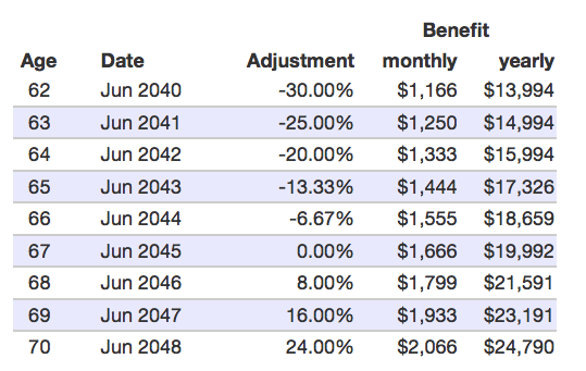
Thinking about moving your cash to a different bank account with a higher interest rate? It’s been a while, but the short-term rates on online savings accounts are going up. Don’t get paid nothing by your megabank. Use this handy calculator to find out how much more money you could earn by switching, which you then can weigh against the time and effort required.

My Money Blog Ultimate Rate Chaser Calculator

How much money are you going to move? (no commas) $
Enter the interest rate (APR) currently being earned:   %
Enter the new interest rate (APR):   %
How many days of lost interest will you have?   day(s)
The approximate number of days you must keep your money at the new rate to break even money-wise is:   days
Assuming the rate difference remains the same,
in 1 month you’ll have earned an extra (estimated):
  
After 6 months, you’ll have earned an extra (estimated):   

Notes

  1. This calculator is based on a rate-chasing breakeven time formula developed previously which takes into account the “days of lost interest”, or the time in between transfers where the money is not earning interest in either account.
  2. Although you will get a very similar answer either way (especially for low interest rates), note that it asks for APR, not APY. I also made a APY to APR calculator if you only have APY and want to be exact.
  3. Usually, there can be between 0-3 days of lost interest when going from one bank to another. This depends on the policies of either bank and also which bank initiates the transfer. This value can significantly affect the break-even time.
  4. The 6-month value (182 days) isn’t simply 6 times the 1-month value (30 days), as the calculator takes into account the time needed first to “break-even”.
  5. Another factor to consider is how likely the current rate difference will persist. Interest rates on savings accounts can change at any time, whereas certificates offer a fixed rate over the guaranteed period.

Last updated 12/14/17.

My Money Blog has partnered with CardRatings and may receive a commission from card issuers. Some or all of the card offers that appear on this site are from advertisers and may impact how and where card products appear on the site. MyMoneyBlog.com does not include all card companies or all available card offers. All opinions expressed are the author’s alone, and has not been provided nor approved by any of the companies mentioned.

MyMoneyBlog.com is also a member of the Amazon Associate Program, and if you click through to Amazon and make a purchase, I may earn a small commission. Thank you for your support.


Pretirement App: Interactive Countdown Clock to Financial Freedom

My Money Blog has partnered with CardRatings and may receive a commission from card issuers. Some or all of the card offers that appear on this site are from advertisers and may impact how and where card products appear on the site. MyMoneyBlog.com does not include all card companies or all available card offers. All opinions expressed are the author’s alone.

pretireapp

What would you do if you knew that skipping that morning $4 coffee/muffin combo every day would get you 8 months closer to financial freedom? What if I told you that buying that $40k car instead of the $25k one would only extend your working years by 3 months? That’s the entire purpose of the Pretirement app (Apple iOS/Android):

A financial independence app that instantly converts spending or savings decisions into days, weeks, or years of your life.

After you supply some initial numbers and assumptions, it will provide a countdown timer to your financial freedom date. You can then input a specific change to your current saving/spending routine, and it will show you the impact to that date. Found via Reuters.

pretire2

There are no fancy Monte Carlo simulations, but the underlying math appears correct and the overall design is pleasing in a minimalist way.

What the app shows you is that long-term habits matter more than temporary changes. If you make permanent saving change like dropping the morning $4 breakfast stop, you can put more money towards your nest egg and your required nest egg is smaller. If you just do a one-time saving of $100 or even $1,000, it really doesn’t make much of a dent. You need to be able to repeat the savings over and over. It’s similar to weight loss: Diets don’t work.

Hopefully, people can use this information as activation energy to change their habits for the better. (Ironically, activation energy is explained using coffee…) The developer Danny Murphy himself has started cooking more and eating out less after going through this exercise. It took us lot of initial effort to learn how to cook efficiently, but after developing a set of “go-to meals” and a pre-plan method it has become much easier.

If you are truly serious about early retirement, my advice would be to look for things that you can change permanently and/or automate so you can repeat it without requiring constant willpower. This usually means a larger, upfront effort. Up your 401(k) contribution by 1% every year. Relocate to a cheaper city. Move to cheaper housing. Search for a better job. Once you set yourself up on the right path, go ahead and enjoy your prioritized expenses – be it high-quality coffee or fun cars.

My Money Blog has partnered with CardRatings and may receive a commission from card issuers. Some or all of the card offers that appear on this site are from advertisers and may impact how and where card products appear on the site. MyMoneyBlog.com does not include all card companies or all available card offers. All opinions expressed are the author’s alone, and has not been provided nor approved by any of the companies mentioned.

MyMoneyBlog.com is also a member of the Amazon Associate Program, and if you click through to Amazon and make a purchase, I may earn a small commission. Thank you for your support.


Portfolio Visualizer: Asset Allocation Backtesting and Monte Carlo Simulation Tool

My Money Blog has partnered with CardRatings and may receive a commission from card issuers. Some or all of the card offers that appear on this site are from advertisers and may impact how and where card products appear on the site. MyMoneyBlog.com does not include all card companies or all available card offers. All opinions expressed are the author’s alone.

portpie_blank200
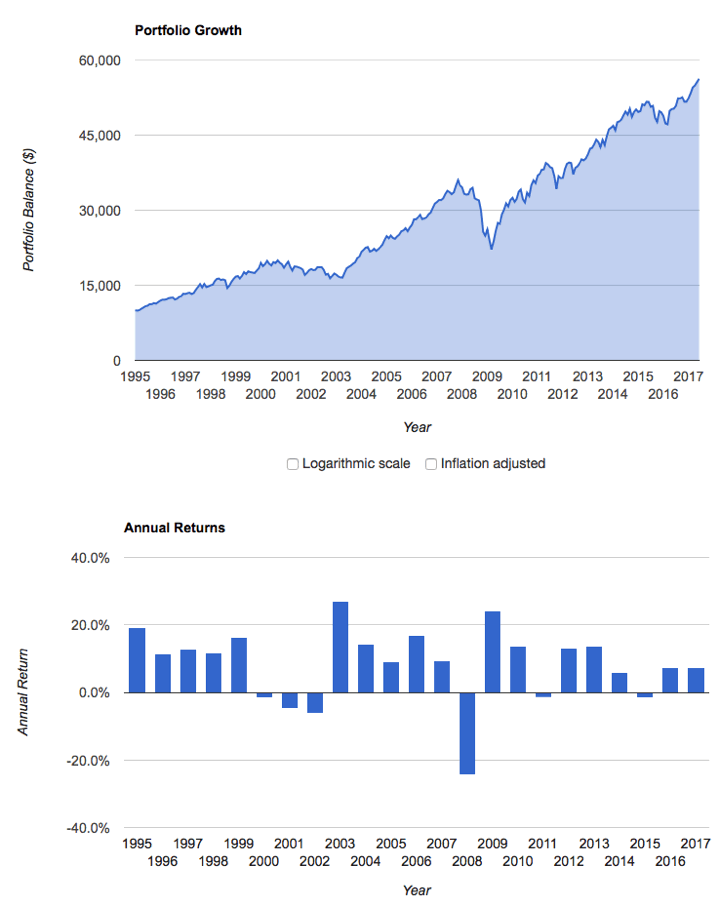
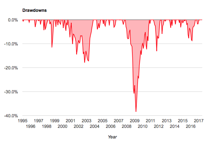
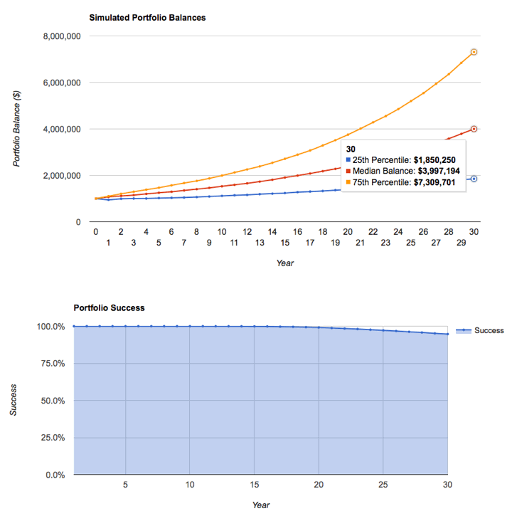
Here’s another neat (and free!) portfolio analysis tool – PortfolioVisualizer.com. You can upload a custom asset allocation and get all sorts of backtest data and Monte Carlo simulation results from it. If you register for an account, it will remember your model portfolios for future use.

I created a custom portfolio “MMB Default” similar to my current portfolio asset allocation and below are selected charts that were produced. Here’s the summary:

pv1

Historical portfolio growth and annual returns. (Note that the time period shown was limited because the available data for Emerging Markets only went from 1995-2017. Apparently there are some ongoing issues with data licensing.)

pv2

Historical drawdowns during the same period. This provides a good feel of how “painful” it was to hold this portfolio. 2009 was certainly a stressful year when both our portfolio and future job prospects were being questioned.

pv3

Monte Carlo simulation of 4% withdrawal rate over a 30-year retirement period. I used my custom portfolio and had it simulate a withdrawal rate of $40,000 from a $1,000,000 portfolio (4%), adjusted annually for inflation, for a 30-year period. You can alter nearly all of these variables (withdrawal rate, inflation adjustments, period length, etc). Monte Carlo basically looks at many possible trajectories based on historical asset return characteristics. If things turn out well, you end up with a “runaway” portfolio, but if they don’t you can hit zero pretty fast.

pv4

The success rate looks at the percentage of simulated scenarios that end up with a positive value at the end of the period. At a 4% withdrawal rate for 30 years, it was 95%. At a 5% withdrawal rate for 30 years, it was only 84%. At a 5% withdrawal rate for 50 years, it was only 69%.

Here’s where I warn you that Monte Carlo simulations are not the end-all of portfolio safety. You can’t predict the next 50 years when you can barely look back 50 years. Living off a portfolio for decades involves not just a reasonable rate of withdrawal but planning as to how you could cut expenses or create additional income if conditions go sour for an extended time period. I’d rather have 90% theoretical safety and a flexible backup plan over 99% theoretical safety and no backup plan.

Portfolio Visualizer has several additional features that I may never use, but even the above is enough to make it a very interesting tool for the DIY investor. I hope they get their data source issues sorted out eventually. You can find all of my posts about portfolio tools in the Tools & Calculators category.

My Money Blog has partnered with CardRatings and may receive a commission from card issuers. Some or all of the card offers that appear on this site are from advertisers and may impact how and where card products appear on the site. MyMoneyBlog.com does not include all card companies or all available card offers. All opinions expressed are the author’s alone, and has not been provided nor approved by any of the companies mentioned.

MyMoneyBlog.com is also a member of the Amazon Associate Program, and if you click through to Amazon and make a purchase, I may earn a small commission. Thank you for your support.


Research Affiliates Custom Portfolio Expected Returns Tool

My Money Blog has partnered with CardRatings and may receive a commission from card issuers. Some or all of the card offers that appear on this site are from advertisers and may impact how and where card products appear on the site. MyMoneyBlog.com does not include all card companies or all available card offers. All opinions expressed are the author’s alone.

crystal_ball_hp

Investment advisory firm Research Affiliates has updated their interactive Asset Allocation tool, which now provides estimates of expected returns for more than 130 asset classes and model portfolios. There are two expected return models, “valuation-dependent” and “yield-plus-growth”. In addition, you can input your own custom asset allocation.

My initial reaction is that while the tool got new bells and whistles, it also became more confusing to navigate and harder on the eyes. Here’s a screenshot of their scatter plot showing the expected risk and return for several asset classes under their valuation-dependent model.

raf_aa1

I created a custom portfolio “CustomMMB” using my current portfolio asset allocation and it is charted below on their risk/return map. In a separate window (not shown) you can see how each individual asset class contributes to the total expected return.

raf_aa2

As you can see, my portfolio did not offer the maximum expected return for its risk level. The RA efficient model portfolio that did includes an exotic mix of asset classes, including Emerging Markets bonds (non-local currency), Bank Loans, US Private Equity, European Private Equity, and direct investments into US Commercial Real Estate (not through REITs). Unfortunately, I’m not even sure how to access many of those asset classes.

I appreciate that they freely share their research methodology and results, specifically covering the valuation perspective. US Equities have historically high valuations, but interest rates are also at historically lows. The next 10 years should be interesting…

Another portfolio analysis tool that lets you input your specific asset allocation is PortfolioCharts.com Safe Withdrawal Rate calculator. This Research Affiliates tool says my expected 10-year real return is only 2.4% (equates to a nominal expected return of 4.6%). The PortfolioCharts.com tool says the same personal asset allocation has a historical perpetual withdrawal rate of over 4% over a 40-year timeframe.

My Money Blog has partnered with CardRatings and may receive a commission from card issuers. Some or all of the card offers that appear on this site are from advertisers and may impact how and where card products appear on the site. MyMoneyBlog.com does not include all card companies or all available card offers. All opinions expressed are the author’s alone, and has not been provided nor approved by any of the companies mentioned.

MyMoneyBlog.com is also a member of the Amazon Associate Program, and if you click through to Amazon and make a purchase, I may earn a small commission. Thank you for your support.


PortfolioCharts.com Safe Withdrawal Rate Tool (Updated)

My Money Blog has partnered with CardRatings and may receive a commission from card issuers. Some or all of the card offers that appear on this site are from advertisers and may impact how and where card products appear on the site. MyMoneyBlog.com does not include all card companies or all available card offers. All opinions expressed are the author’s alone.

eggos
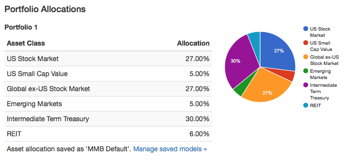
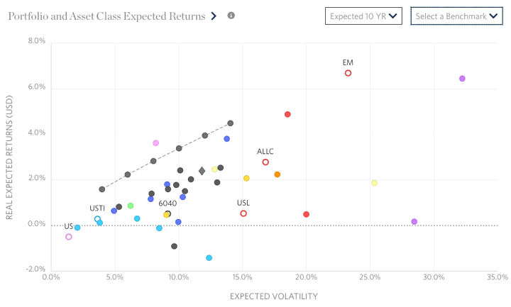
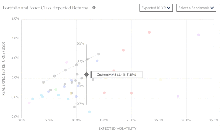
I just noticed that PortfolioCharts.com has updated their Withdrawal Rate Calculator. It has improved visualizations and as a personal finance geek I even found it fun. You can enter your specific asset allocation slices down to 1% and see customized results.

The Withdrawal Rates calculator shows the safe withdrawal rate for any asset allocation over a variety of retirement durations based on real-life sequence of returns. Those looking to retire early or leave money to heirs can also see the perpetual withdrawal rate that protected the original inflation-adjusted principal.

You can read about the specifics behind these improvements here. You should also read all the assumptions here. For example:

The withdrawal rate is the percentage of the original portfolio value used for one year of retirement expenses. Each year, expenses are adjusted for inflation (not for portfolio size) to maintain constant purchasing power.

Briefly, a “safe” withdrawal rate (orange) allowed a portfolio to go as low as $1 but never hit zero at the end of the timeframe. In other words, the ride could have still gotten quite hairy for a while. A “perpetual” withdrawal rate (green) never ended up less than the initial principal, even adjusted for inflation. The author Tyler recommends the perpetual WR for early retirees or for people who desire to leave an inheritance for heirs.

Here is the specific chart for my current portfolio asset allocation:

pcharts_me

I would be quite happy with being able to confidently withdraw over 4% (+ inflation adjustments) of my portfolio for the next 40 years. The short-term drawdown paths can still be scary though. The usual caveats with using backtested data also apply.

Playing around, I noticed that the simplest way to change things up was by adding a healthy chunk (~20%) of gold instead of stocks. This seemed to significantly improve the perpetual withdrawal rates in the short-term (0 to 15 years). It’s too bad I still don’t have a firm fundamental understanding of gold. If you can’t maintain faith in it when things are scary, then you shouldn’t own it in your portfolio.

My Money Blog has partnered with CardRatings and may receive a commission from card issuers. Some or all of the card offers that appear on this site are from advertisers and may impact how and where card products appear on the site. MyMoneyBlog.com does not include all card companies or all available card offers. All opinions expressed are the author’s alone, and has not been provided nor approved by any of the companies mentioned.

MyMoneyBlog.com is also a member of the Amazon Associate Program, and if you click through to Amazon and make a purchase, I may earn a small commission. Thank you for your support.


Simple Portfolio Rebalancing Spreadsheet Template (Google Drive)

My Money Blog has partnered with CardRatings and may receive a commission from card issuers. Some or all of the card offers that appear on this site are from advertisers and may impact how and where card products appear on the site. MyMoneyBlog.com does not include all card companies or all available card offers. All opinions expressed are the author’s alone.

gsheets
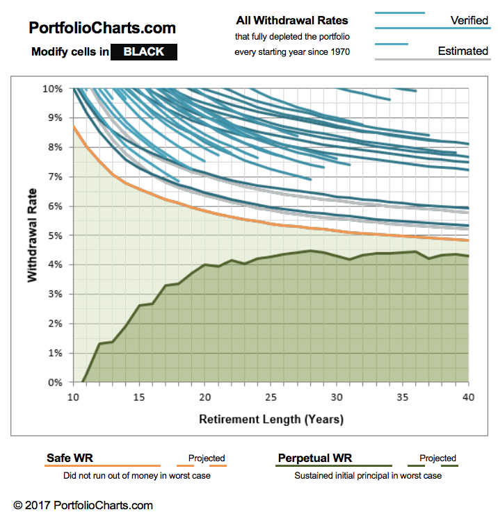
Updated. Automated portfolio management services like
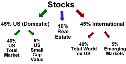
 Wealthfront and Betterment will help you manage a diversified portfolio of low-cost index funds for a fee. While I understand their appeal for those that wish to outsource that task, I choose to maintain my own diversified portfolio of low-cost index funds. I enjoy having full control of all investment decisions, and I like saving the management fee (and adding that money to my snowball).

An important part of this DIY portfolio management is staying close to your target asset allocation. I use a very simple Google Spreadsheet to track my portfolio. Here is the direct link and it is also embedded below. Yellow cells are those meant to be edited.

(Download a free copy: I am sharing this spreadsheet online – free of charge – in read-only format. However, please make a copy of it using the menu option File > Make a copy or download it as an Excel file using option File > Download as). Any requests for edit access to the original public spreadsheet will be denied, because you would be changing the appearance for everyone.)


Here are some guidance on how to use the spreadsheet:

1. Decide on a target asset allocation. Don’t use the generic one I put above. There is no perfect portfolio. You can find plenty that look great based on history at this moment, but that will not be the perfect portfolio 5, 10, 25 years down the line. The best portfolio is the one that you can stick through even after your fanciest asset classes have negative returns for 5+ years.

Here are a few model portfolios to get you started. Below is what I have settled on for myself. Details here. You only have to enter this once as long as your target asset allocation stays the same.

2. Enter your total balances for each asset class. The easiest way to grab my holdings from multiple brokerage accounts is to use a aggregation service like Personal Capital (review). If you don’t have that many accounts, simply log into each individual website and add up your totals by asset class.

You could solely rely upon a service like Personal Capital to manage your portfolio, but I tend to use some specific asset classes like “US Small Value” or “Emerging Markets Value” which Personal Capital does not recognize. I do enjoy the fact that it pulls in all of my holdings and balances automatically into one screen and is always updated.

3. Check out the actual breakdown vs. your target breakdown. The spreadsheet shows the current actual percentage breakdown vs. your target breakdown, as well as the dollar amounts of any differences. A positive number means you need to buy more to reach your theoretical target (negative means sell). In the fictitious example shown, I might feel that I was close enough that I wouldn’t really bother with any rebalancing. If things were really off, I could buy/sell as needed.

3. Rebalance with new cashflow, dividends, and interest. Choose your frequency of “forced” rebalancing. By using this spreadsheet, you can see which asset classes should be invested in currently to bring you back towards your target asset allocation. This is where you should invest any new cashflow (i.e. paycheck, dividends, rental income, or interest that your portfolio generates).

In addition, you can rebalance by selling some asset classes and then buying another. I try not to sell too often as to avoid capital gains taxes. You can do this on a set calendar basis such as annually on your birthday or quarterly. Another method is to only rebalance once your percentages are off by a certain amount, like a tolerance band of +/- 5%. I personally check in quarterly to see where I should invest any new cashflows, and if things are really off then I rebalance by selling something at most once a year. If you have sizable taxable holding, you could also attempt some tax-loss harvesting during these check-ins.

Recap. If you are managing your own portfolio, it is important not to stray too far from your target asset allocation. In order to know where you should invest new funds, I track my portfolio in two ways. First, I use Personal Capital for a real-time, daily snapshot of my holdings. Second, I manually update this spreadsheet each quarter and print out a copy for my permanent, physical records. This takes about 15 minutes every 3 months. Using these two methods, I maintain complete control over my portfolio and I don’t have to pay any management fees to a robo-advisor.

My Money Blog has partnered with CardRatings and may receive a commission from card issuers. Some or all of the card offers that appear on this site are from advertisers and may impact how and where card products appear on the site. MyMoneyBlog.com does not include all card companies or all available card offers. All opinions expressed are the author’s alone, and has not been provided nor approved by any of the companies mentioned.

MyMoneyBlog.com is also a member of the Amazon Associate Program, and if you click through to Amazon and make a purchase, I may earn a small commission. Thank you for your support.


FileThis App Review: Automatically Backup Your Online Statements

My Money Blog has partnered with CardRatings and may receive a commission from card issuers. Some or all of the card offers that appear on this site are from advertisers and may impact how and where card products appear on the site. MyMoneyBlog.com does not include all card companies or all available card offers. All opinions expressed are the author’s alone.

Update 2023: FileThis is shutting down.

Old post:

filethis_applogo

A few months ago on my post about Paperless vs. Paper Statements, I received this helpful comment from reader Daveraham:

I like the services FileThis.com. It’s setup similar to MInt, where it stores account information, but instead of fetching dollar amounts and transactions, it grabs every statement available and stores them where you direct. Personally I store it an evernote account and then periodically pull it off to store on a removable HD that get’s stored in a fireproof box. Overkill?? Sure…. But its the point. You want to keep that snapshot of data for a long period of time.

I made a mental note to check the site out and… promptly forgot. I was again reminded in this Liz Weston article about apps to organize your financial life. In November 2015, FileThis announced their 2.0 version with new features. You can use the FileThis.com website, iOS app, or Android app (1.0 version only for now).

FileThis is now one of many “bill organizers” that ask for your account passwords in order to sift through your accounts and remind you of due dates. Personally, I don’t need or use due date reminders. I sit down at the end of every month, read through all my paper statements, track expenses, and pay my bills. I’m an old fart like that (although I do use free online billpay).

I previously shared that I maintain physical statements for critical financial accounts and have it mailed to a secure PO Box. But I also have several other financial accounts which are either dormant, temporarily opened for reviews or experiments, or have low balances which are set to paperless. Ideally, I would still log in and download those PDF statements every month and back them up. But I never do.

FileThis will log in and automatically download all your paperless statements and then save them to your cloud service of choice: Evernote, Dropbox, Google Drive, Box, Amazon Cloud, and more. You can even use their in-house storage (500 mb free). The cost options:

  • Free for up to six (6) connections. Checks weekly.
  • $2 a month ($20 a year upfront) for up to 12 connections. Checks weekly.
  • $5 a month ($50 a year upfront) for up to 30 connections. Checks daily.

Besides things like bank accounts, credit cards, and brokerage statements, FileThis will grab stuff from your mortgage provider, car loan servicer, cell phone bill, utility bills, insurance bills, and even online shopping accounts like Amazon. An added bonus is that they will even grab tax documents like 1099 forms.

I linked up a few accounts, the list is relatively extensive but it couldn’t find a local credit union. Here are some screenshots from my website and smartphone app.

filethis1

filethis2

Remember that the actual files are on your cloud service. Here’s a screenshot from my Dropbox app. The files are stored in the folder Dropbox > Apps > FileThis.

filethis3

This is pretty cool. The initial download basically grabbed all the older documents that were available as well (up to last 3 years, supposedly). They’ll even grab PDF statements if you also get mailed paper statements (assuming they are available), giving you an additional backup copy.

By allowing backups directly to a third-party cloud service (Dropbox in my case), I will still have all of my online statements even if FileThis shuts down some day (remember Manilla?).

The trade-off here is that another FinTech startup has your account logins and passwords. Their security measures seem fair enough (encrypted SSL transmission, passwords are encrypted on server, the documents can be stored at your cloud service). I already track my paperless accounts in real-time with Mint, but I am willing to make this trade-off as I think it’s worth it to have my old statements backed up for me. (Why can’t Mint do this for me too?) The only other service I know that offers something similar is Finovera, but I think they store the statements on their own servers as opposed to your personal Dropbox.

As an existing user, if you sign up using my referral link, both you and I will receive an additional free connection (so you’d have a total of 7 free to start) and an additional 250 mb of free in-house cloud storage.

My Money Blog has partnered with CardRatings and may receive a commission from card issuers. Some or all of the card offers that appear on this site are from advertisers and may impact how and where card products appear on the site. MyMoneyBlog.com does not include all card companies or all available card offers. All opinions expressed are the author’s alone, and has not been provided nor approved by any of the companies mentioned.

MyMoneyBlog.com is also a member of the Amazon Associate Program, and if you click through to Amazon and make a purchase, I may earn a small commission. Thank you for your support.