One thing I really like about personal finance software is the ability to see performance over time. So I decided to plot my net worth over the time I have been tracking it. I only started this blog in December 2004, but I also remembered that I calculated my net worth back in June at $30k. Here are my results:
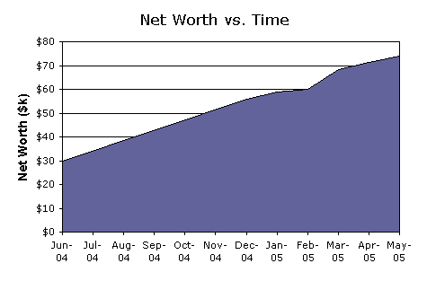
The main thing I get from this is that we’ve been pretty consistent in our savings for the last year or so. Our savings rate is about $44,000 over 11 months, an even $4,000 per month. Wow! I don’t know if we can keep this up, but I do know that we are fortunate to able to do so. Now, it would have been nice to see a great uptick in the graph after starting this blog, since I feel I’ve learned a ton since then, but I mostly due to the stock market things have been pretty calm. I do think that we are well positioned for the future, though. Anyways, back to the Sunday newspaper…
 The Best Credit Card Bonus Offers – March 2024
 Big List of Free Stocks from Brokerage Apps
 Best Interest Rates on Cash - March 2024
 Free Credit Scores x 3 + Free Credit Monitoring
 Best No Fee 0% APR Balance Transfer Offers
 Little-Known Cellular Data Plans That Can Save Big Money
 How To Haggle Your Cable or Direct TV Bill
 Big List of Free Consumer Data Reports (Credit, Rent, Work)
An upward graph is always impressive!