JP Morgan Asset Management recently released the Q3 2017 update to their Guide to the Markets, which is another of those resources worth bookmarking for future updates. Some folks put a lot of time and energy into it, and it contains a lot of interesting charts and graphs. Here’s just one that caught my eye.
I consider myself a relatively conservative income-oriented investor, and this chart shows why it’s been a tough several years to be that type of investor. For much of the last 30+ years, you could have put your hard-earned money in an FDIC-insured certificate of deposit and enjoyed a guaranteed return above inflation. This isn’t even when shopping around for the top rates, just taking the average bank CD rates.
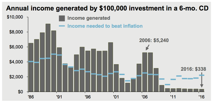
Nowadays, you’re just trying to keep the bleeding to a minimum, jumping at the chance to grab a 3% APY long-term CD that might just keep up with inflation.
This also partially explains why the stock market keeps going up and up. Which would you rather have?
- FDIC-insured cash savings that gives you $1 in annual interest per $100 invested, or a
- S&P 500 ETF with a 4% earnings yield and 2% dividend yield? In other words, a basket of companies that for every $100 invested earns $4 a year in profit and out of that gives you $2 a year in cash dividends?
I really can’t complain as my overall portfolio of stocks, bonds, and bank CDs has more than doubled in the past several years. Yet, I also share that vague feeling of uneasiness with many other investors.
 Alaska Airlines has a Dash for Miles promotion where you can earn up to 3,000 bonus miles: 1,000 bonus miles times three partner sites through September 30, 2017. You must register at the link above first, and then complete at least one transaction from any of the following:
 Here’s another promotion for Visa Checkout (they are really pushing this thing). Create a new Visa Checkout account from Marriott.com and earn up to 1,000 free Marriott Rewards points: Earn 500 points when you sign up for Visa Checkout on Marriott.com and 500 points when you use Visa Checkout within 15 days of signing up.
 Fall promo is live. Starbucks is selling
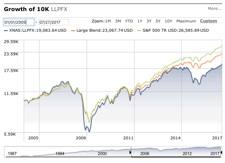
 The wealth management group Del Monte published a

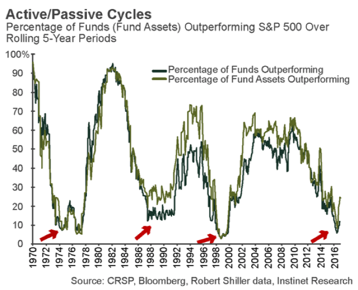
 The American Enterprise Institute used newly-released
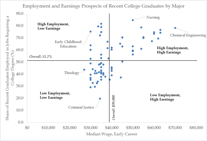


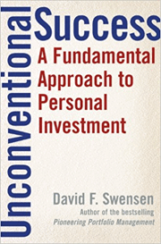 One of the early books that impacted my investing philosophy was
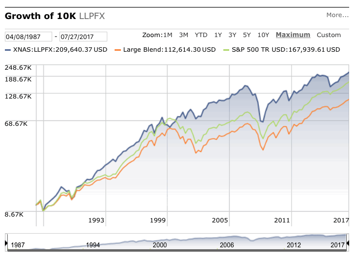


 The Best Credit Card Bonus Offers – March 2024
 Big List of Free Stocks from Brokerage Apps
 Best Interest Rates on Cash - March 2024
 Free Credit Scores x 3 + Free Credit Monitoring
 Best No Fee 0% APR Balance Transfer Offers
 Little-Known Cellular Data Plans That Can Save Big Money
 How To Haggle Your Cable or Direct TV Bill
 Big List of Free Consumer Data Reports (Credit, Rent, Work)